Category ········· Print
Completed ······ September 2022
Completed ······ September 2022


Brandon Trust Annual Report 2021-2022
As Lead designer at Brandon Trust, I was responsible for bringing the content of the annual report to life. I lead this project myself from concept to final product, keeping visual storytelling a priority throughout.
In the past, this visual storytelling has been done using a lot of two dimensional graphics and illustration, but this year we wanted to make it more tangible, to reflect a year of reconnecting and rediscovering our community, and also a year of growth, following the launch of a new five year strategy for the charity.
The outcome is a publication, designed using stationary themed imagery and three-dimensional styling, to be reminiscent of a scrap book or community notice board, celebrating the achievements and memories of the year.
Category ········· Print
Completed ······ January 2021
Completed ······ January 2021
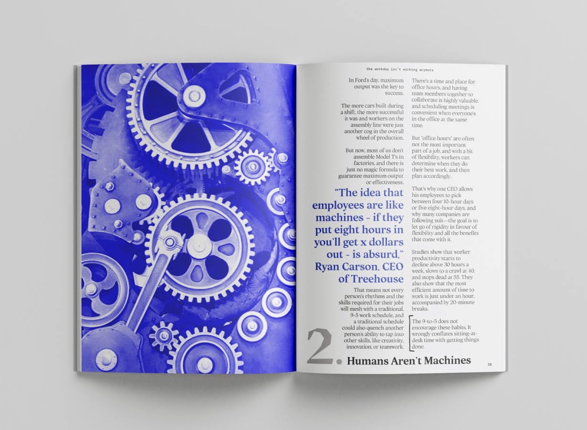
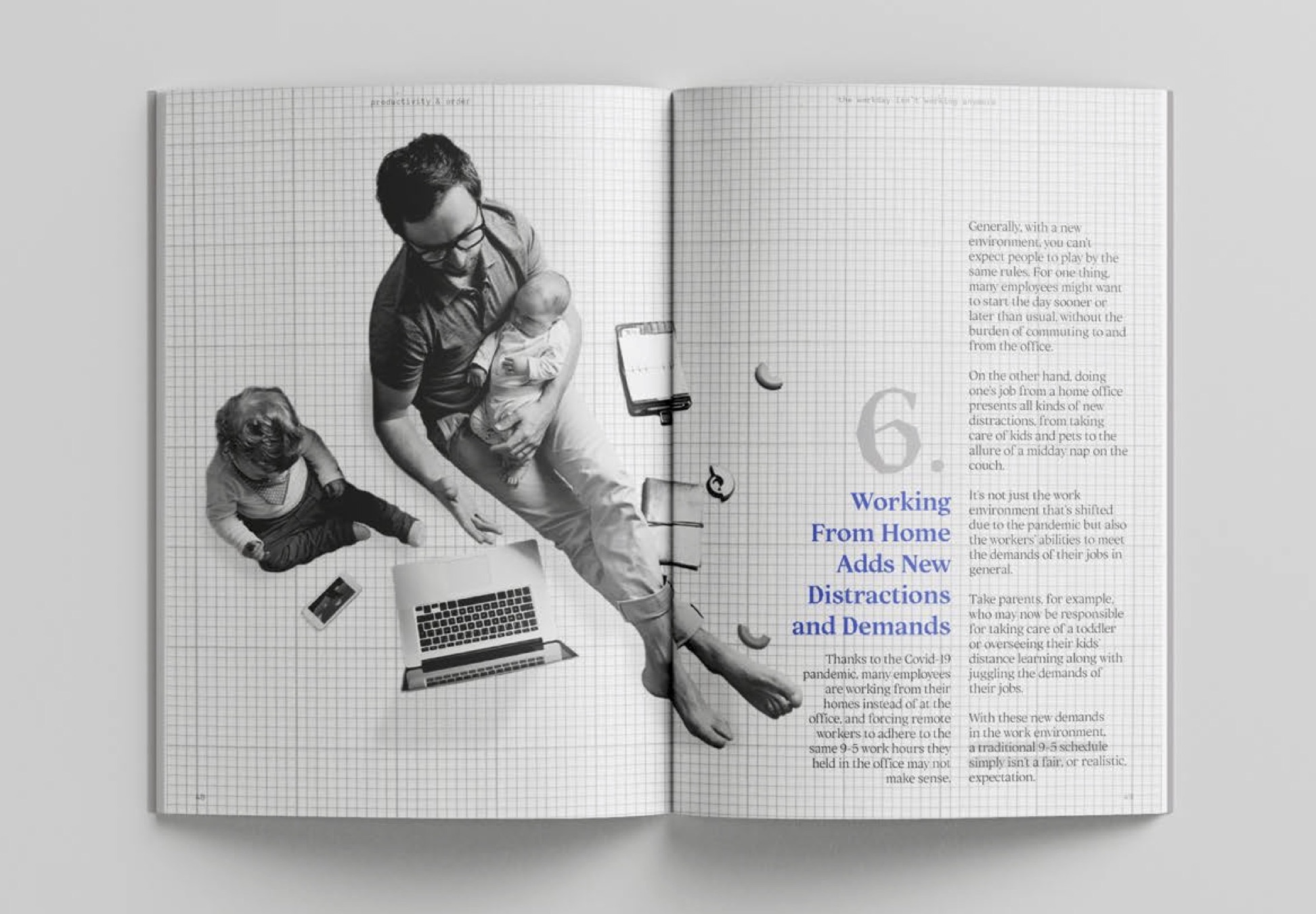
Productivity and Order: Debunking the 9-to-5
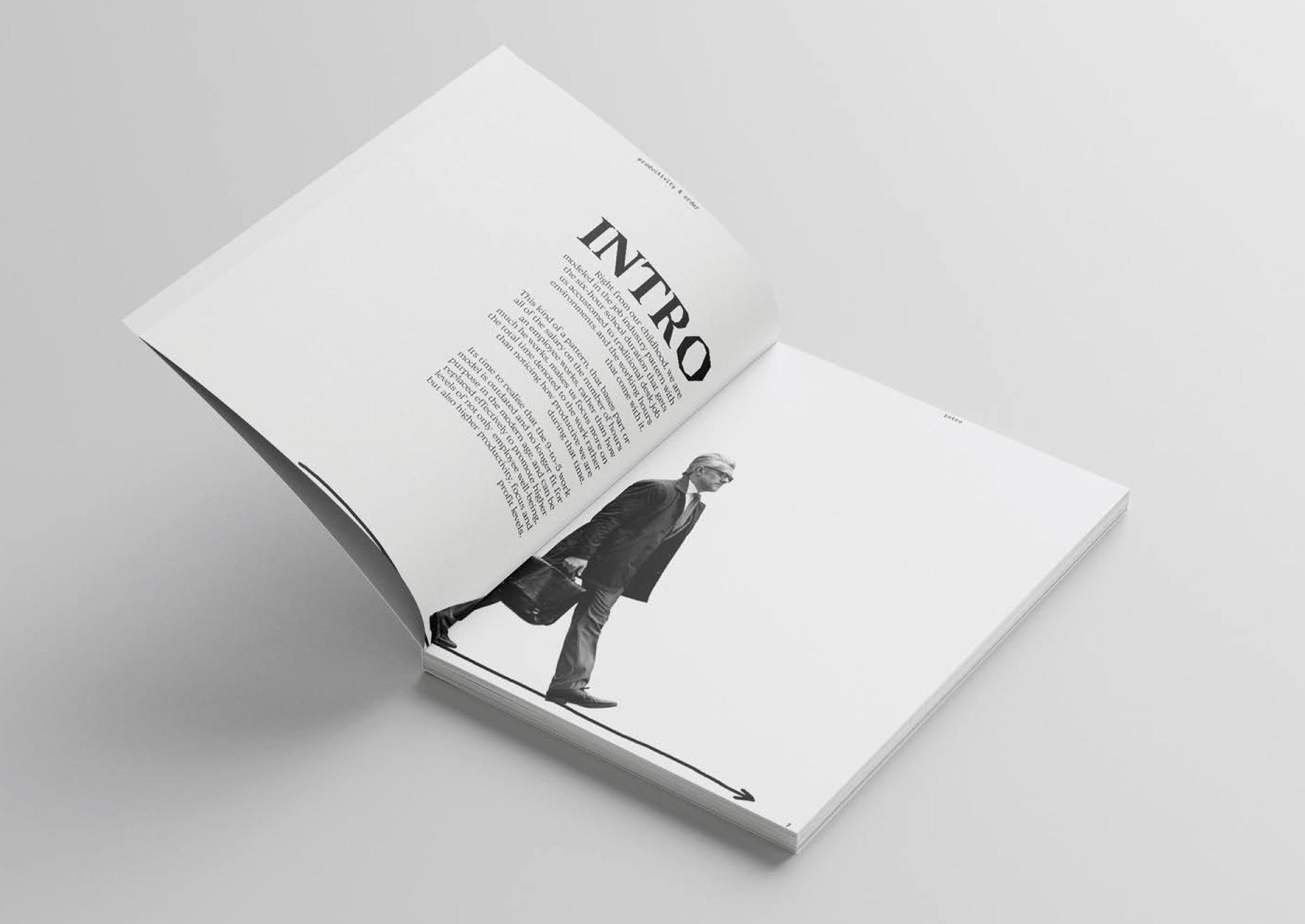
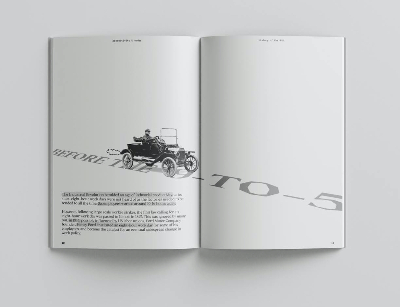
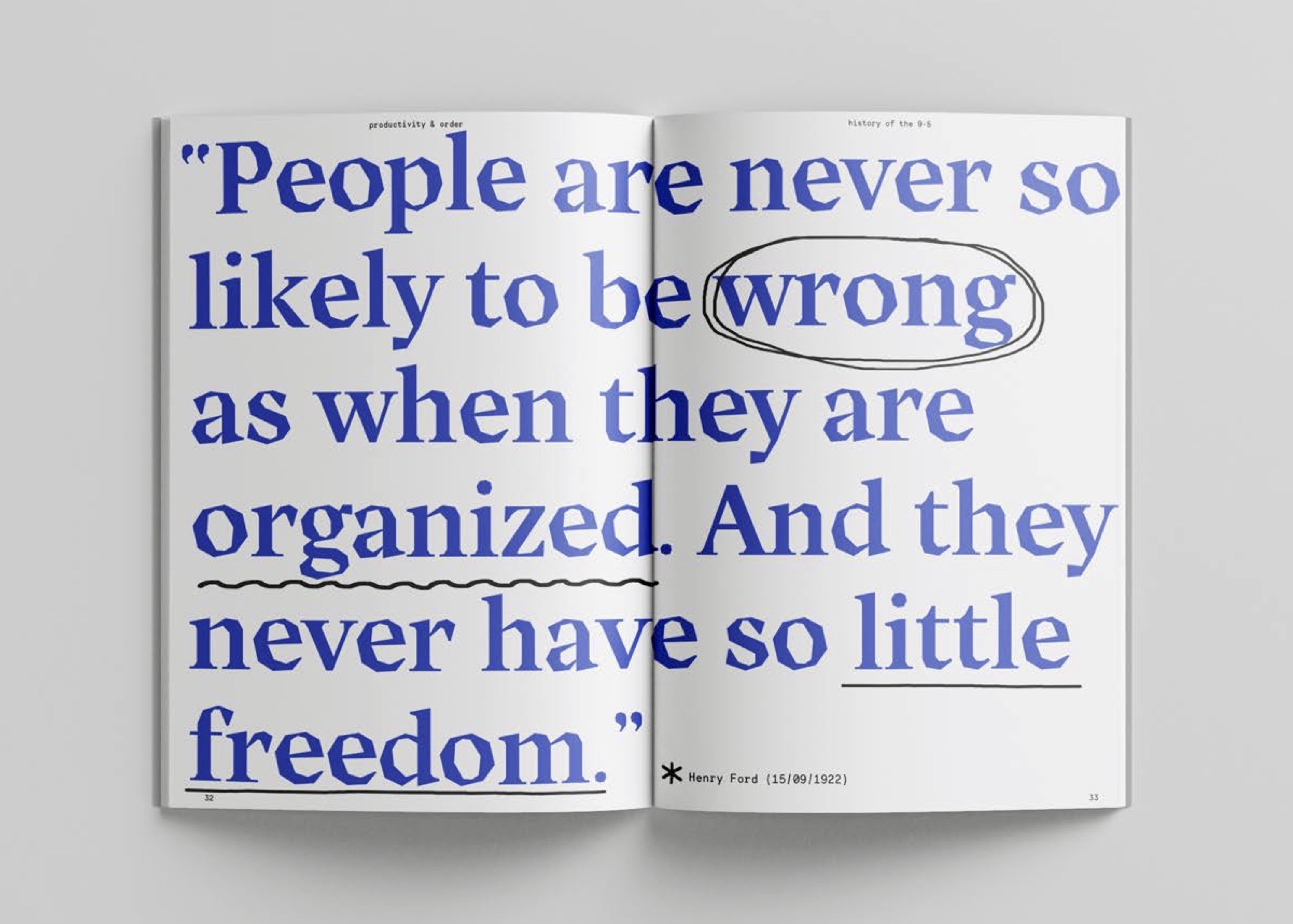
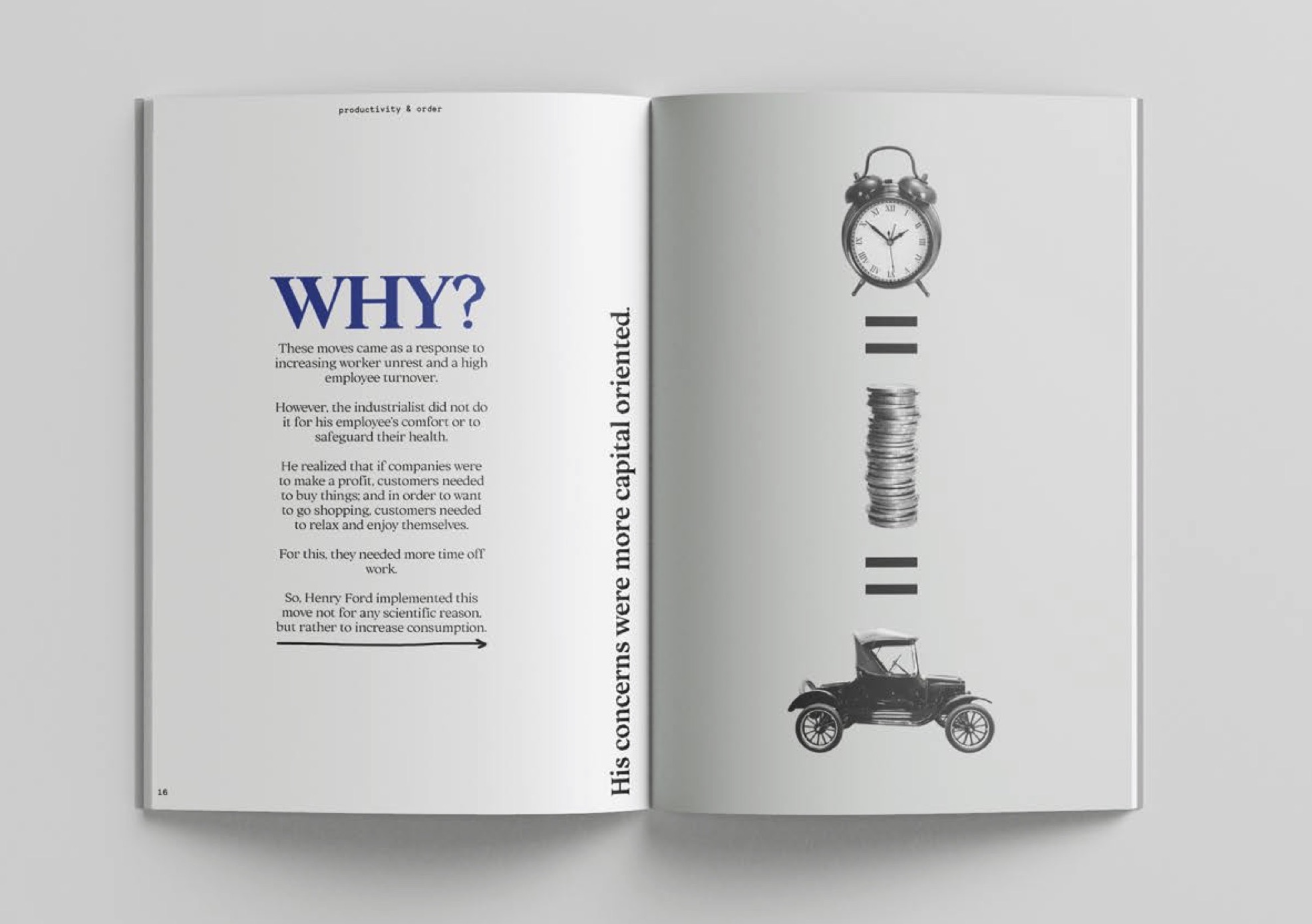
This project was a response to the International Society of Typographic Designers (ISTD) 'Putting Things in Order' 2020/2021 competition brief.
It explores the modern-day business model of an 8-hour work day, its origins and initial purpose, its problems, and its alternatives, providing an argument for its abolition.
This project integrates archival imagery, typographic design, photo editing and annotation, for a corporate and industrial feel.
The outcomes for this project consist of a 70 page publication, several pages of which can be seen here and two typographic poster variations, shown below.
Category ········· Print
Completed ······ November 2020
Completed ······ November 2020
Arson Flipbook
A flip book demonstrating how quickly a fire can escalate in the home if a child is left unattended with matches.
The flip book aims to demonstrate in real-time and (near-accurate match scale) how quickly a flame sparks from a match.
It is accompanied with statistics on domestic fires to encourage parents to hide matches from their curious children.
Category ········· Print
Completed ······ June 2021
Completed ······ June 2021

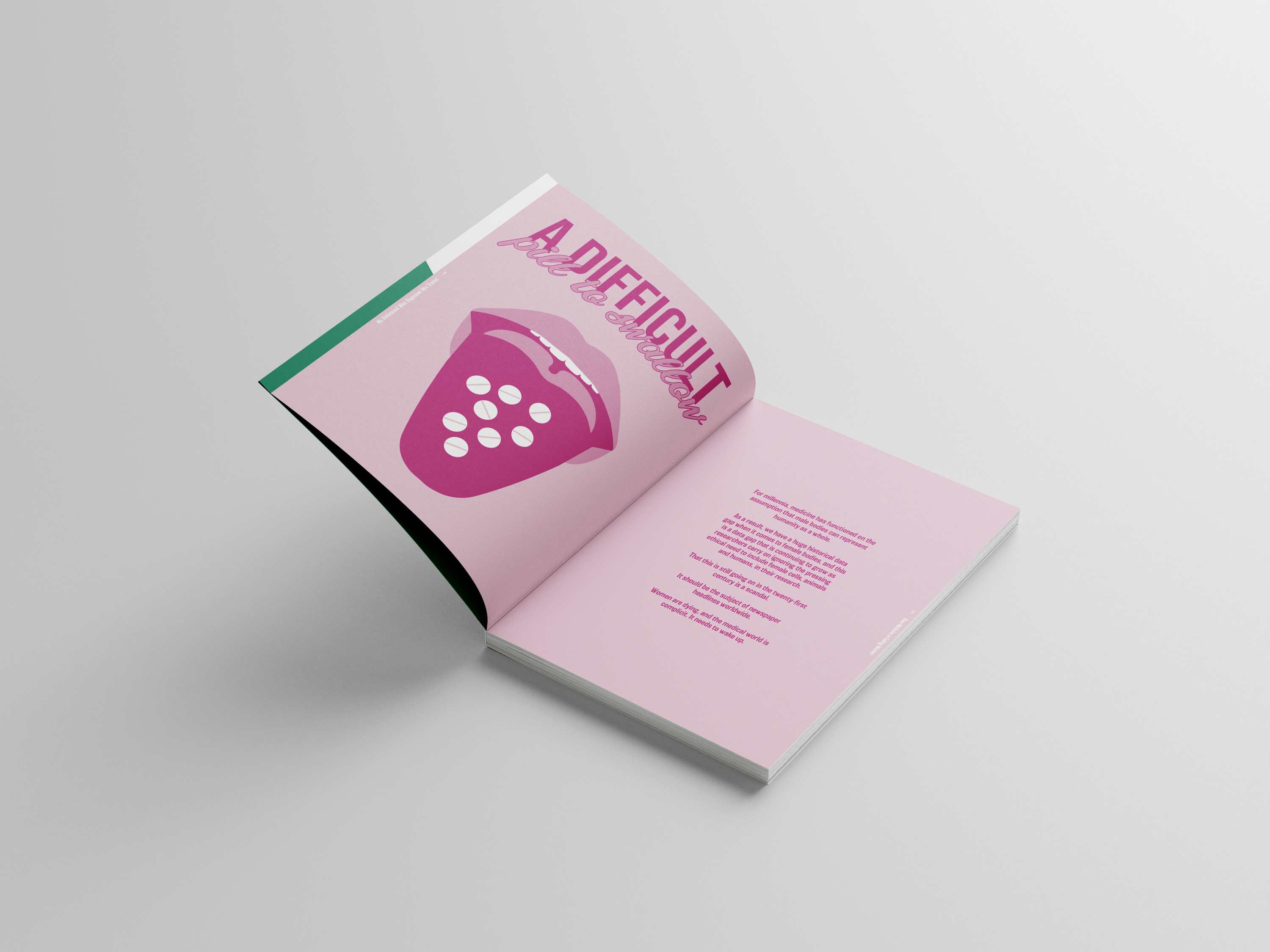


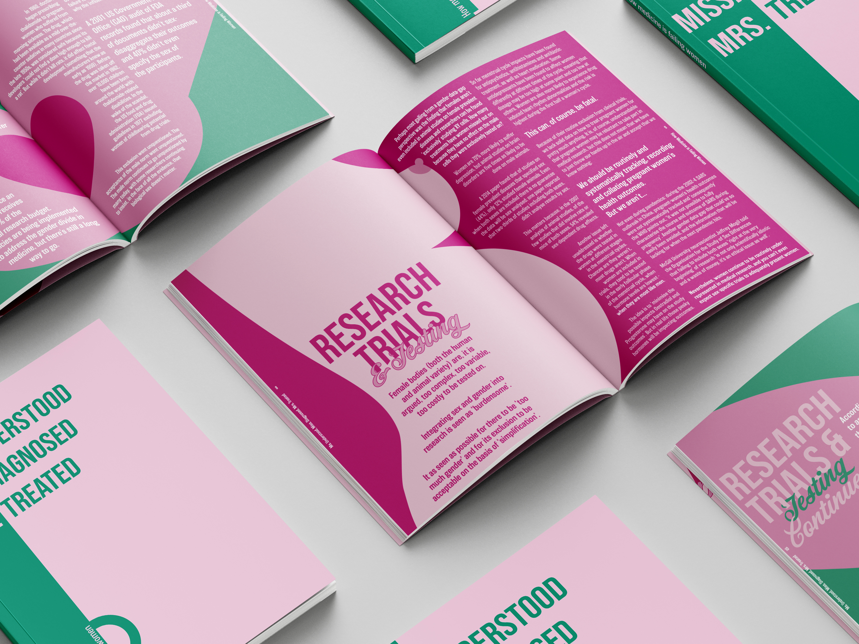


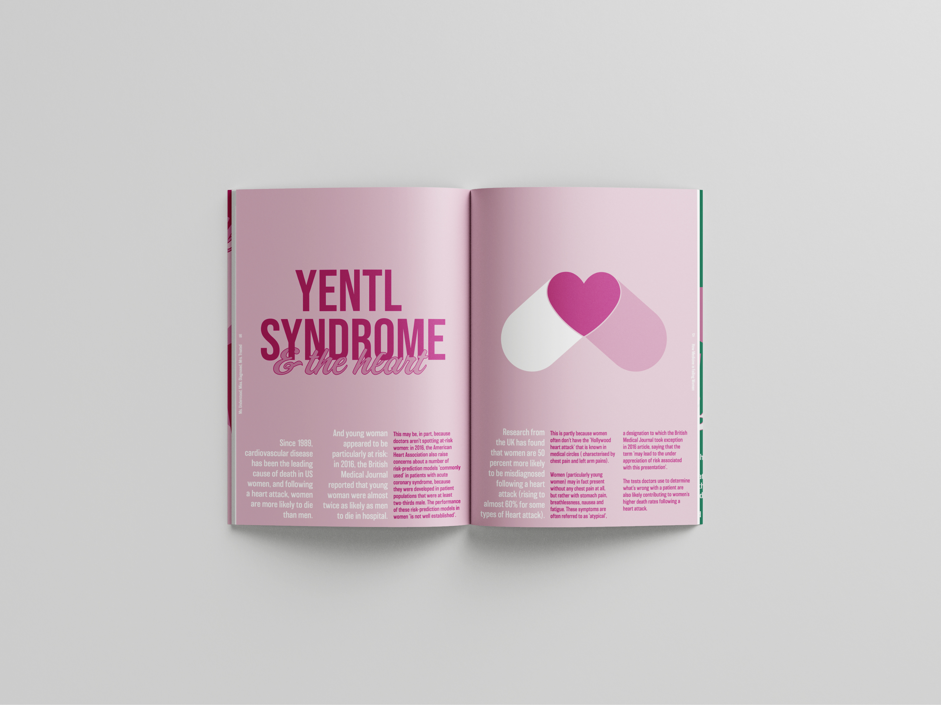

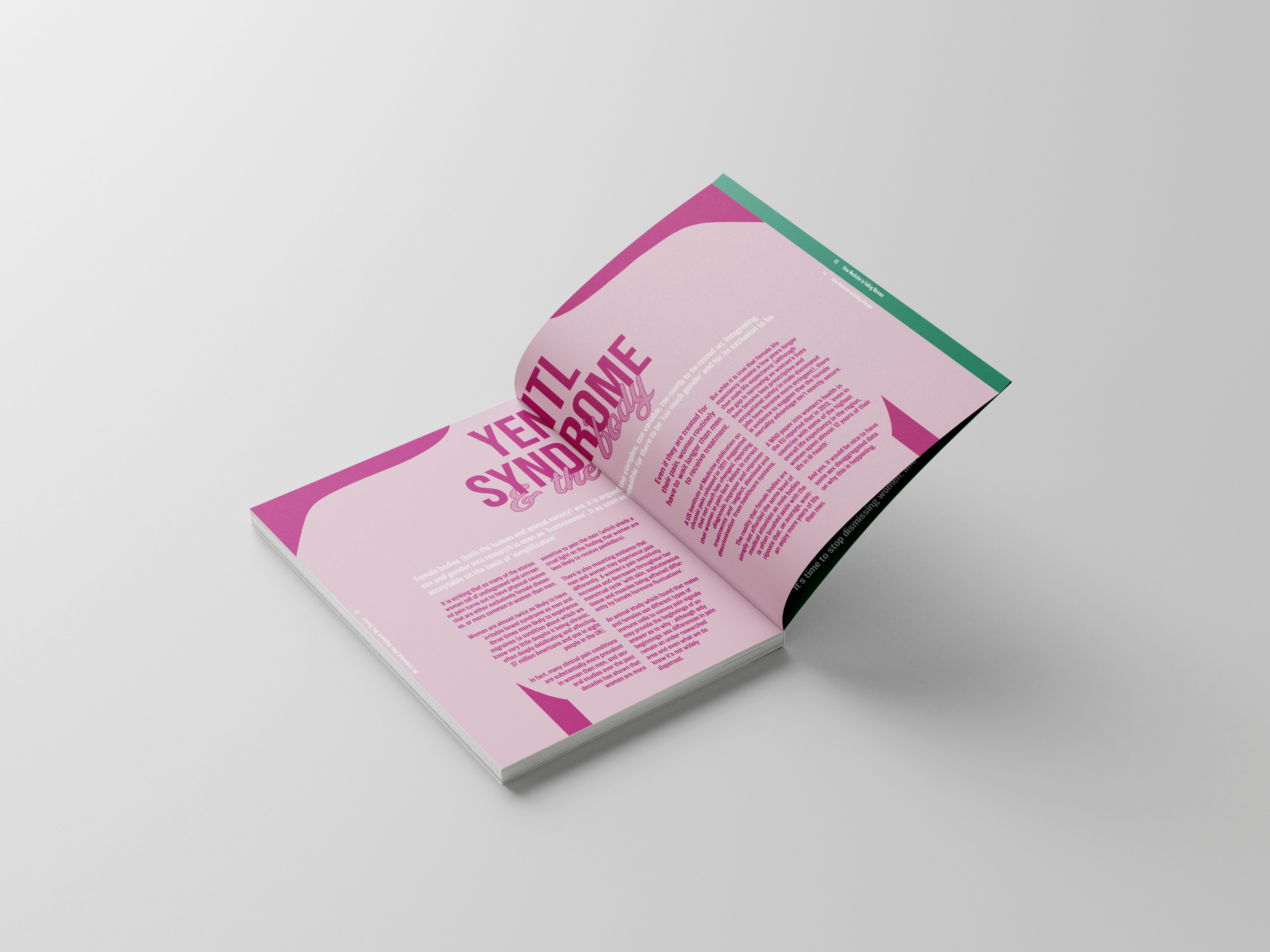

Ms.Understood, Miss.Diagnosed, Mrs.Treated
Taking a closer look at the issues of gender bias in health and medicine, this publication illustrates the extent to which medicine favours men, ‘from root to tip’.
This publication combines content from the book ‘Invisible Women’ by Carolina Criado Perez and digital graphic illustration, and the aim was to integrate the information into the imagery.
Category ········· Print
Completed ······ June 2021
Completed ······ June 2021
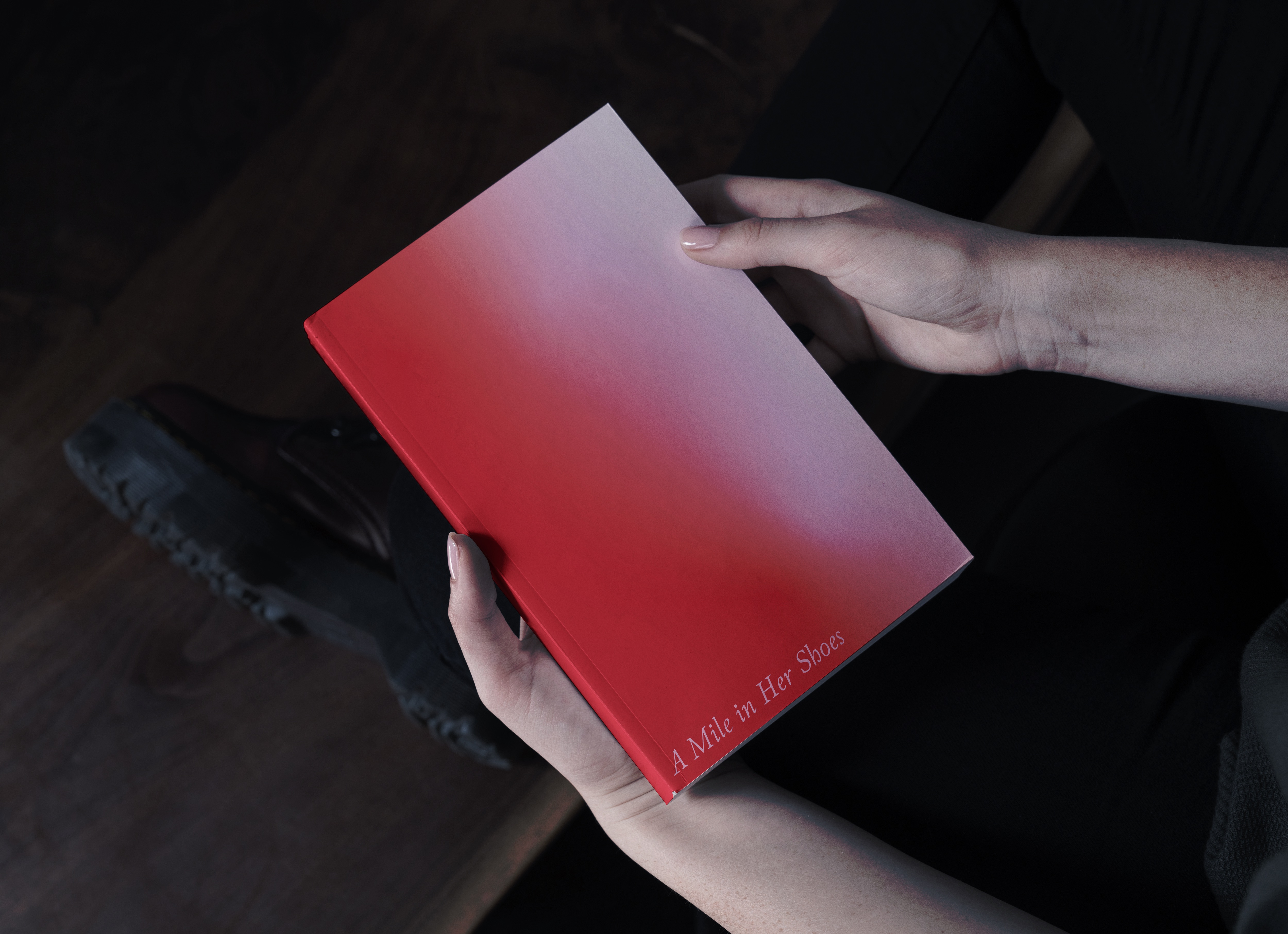
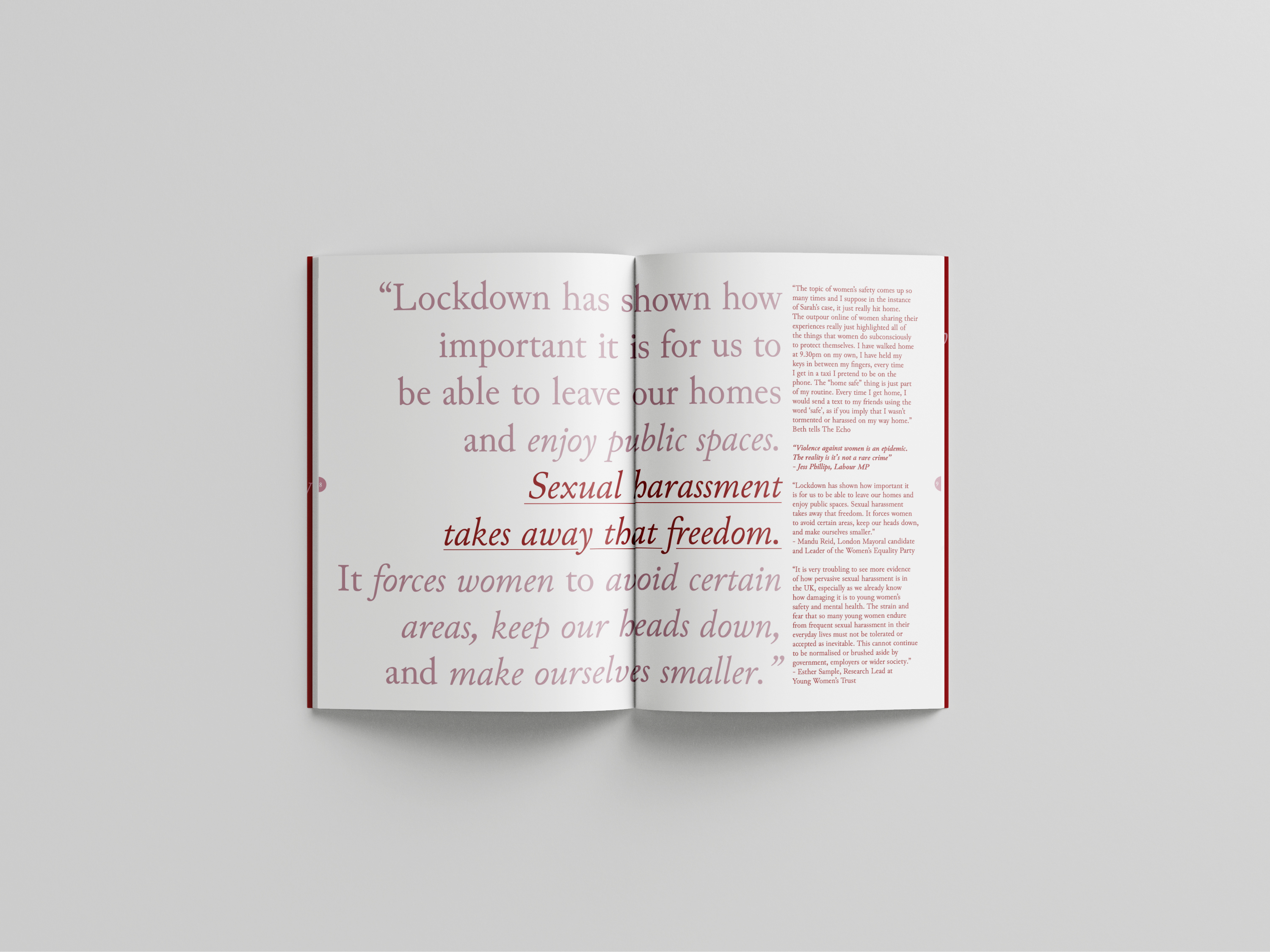
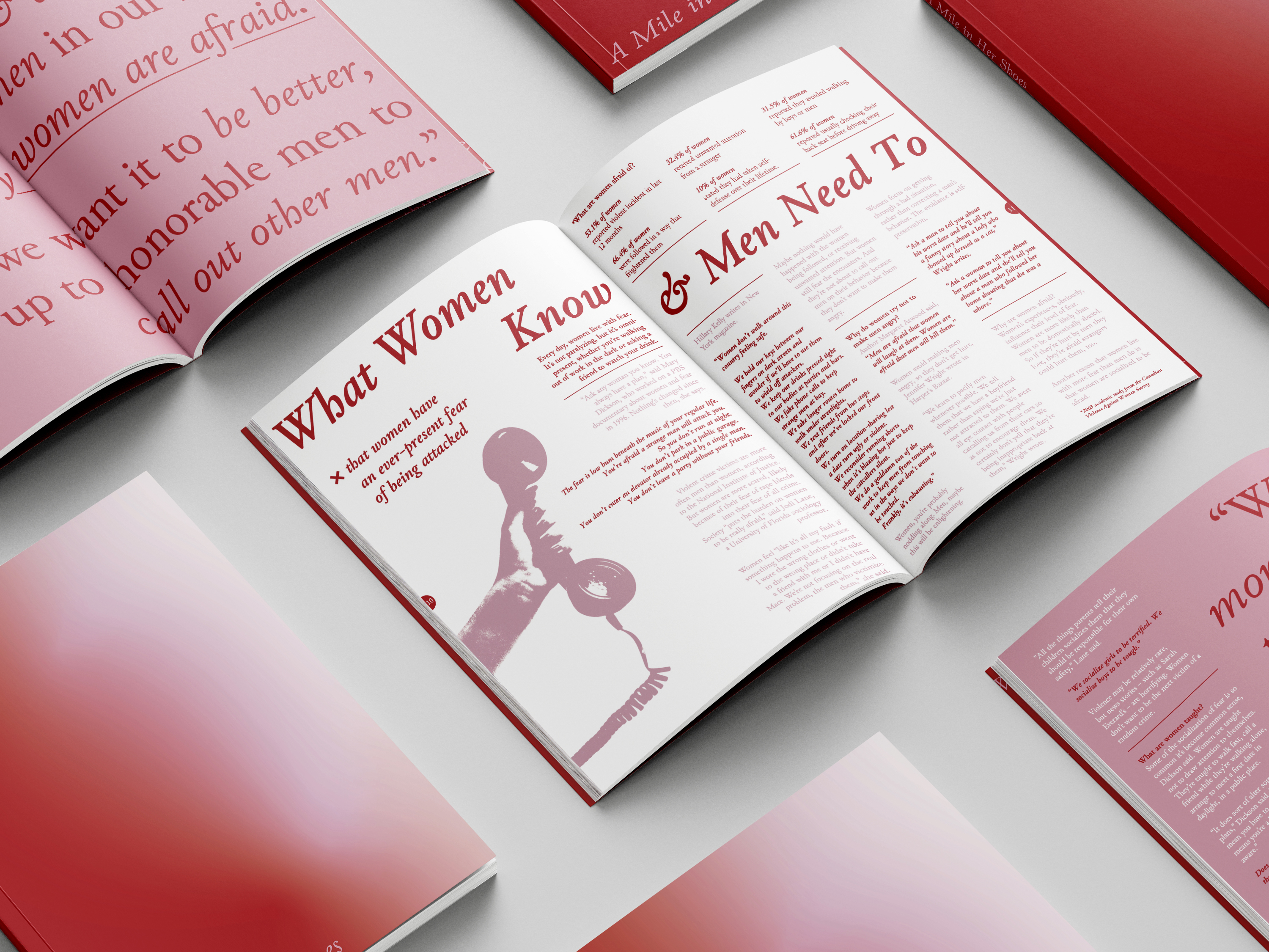
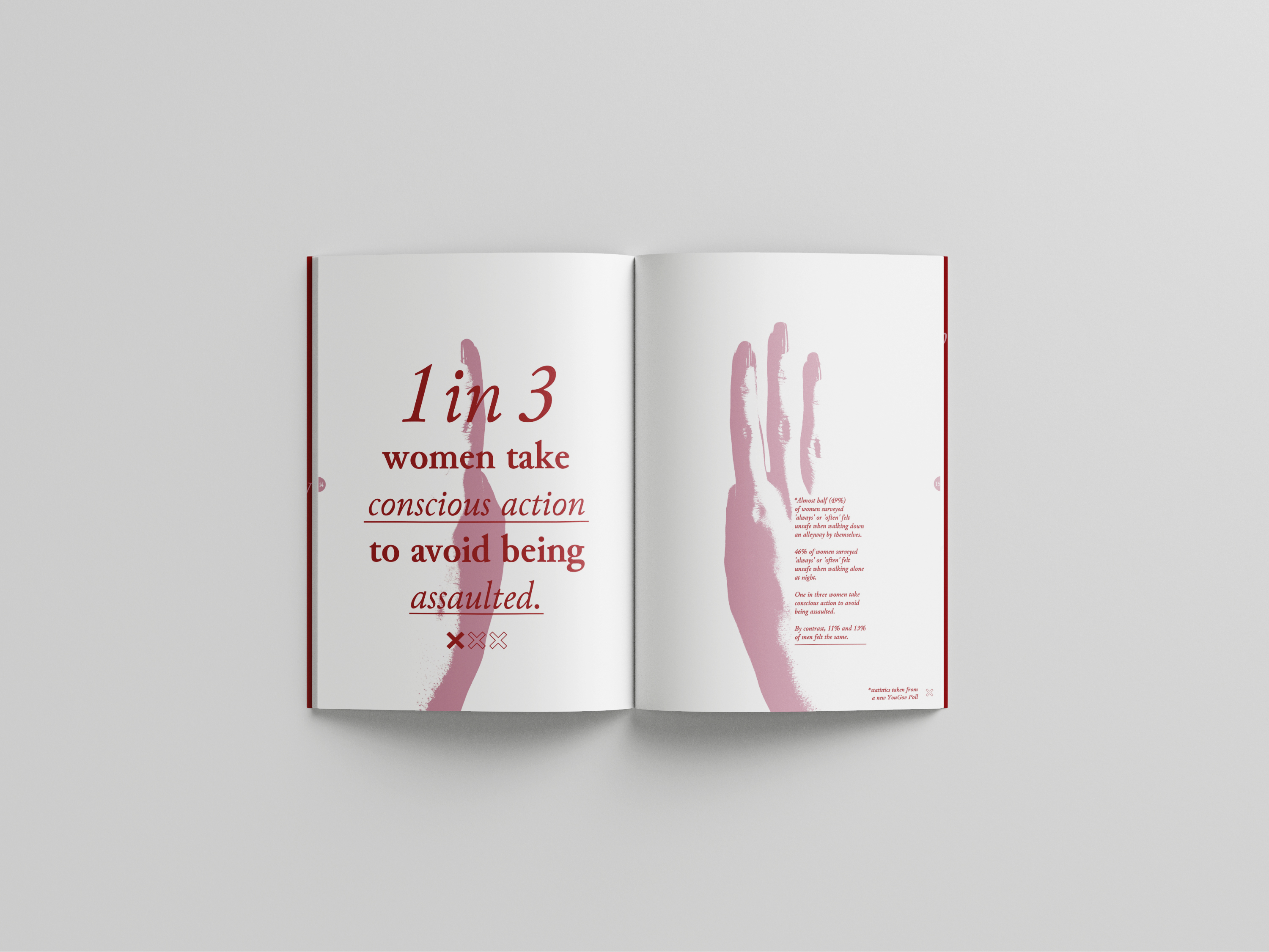
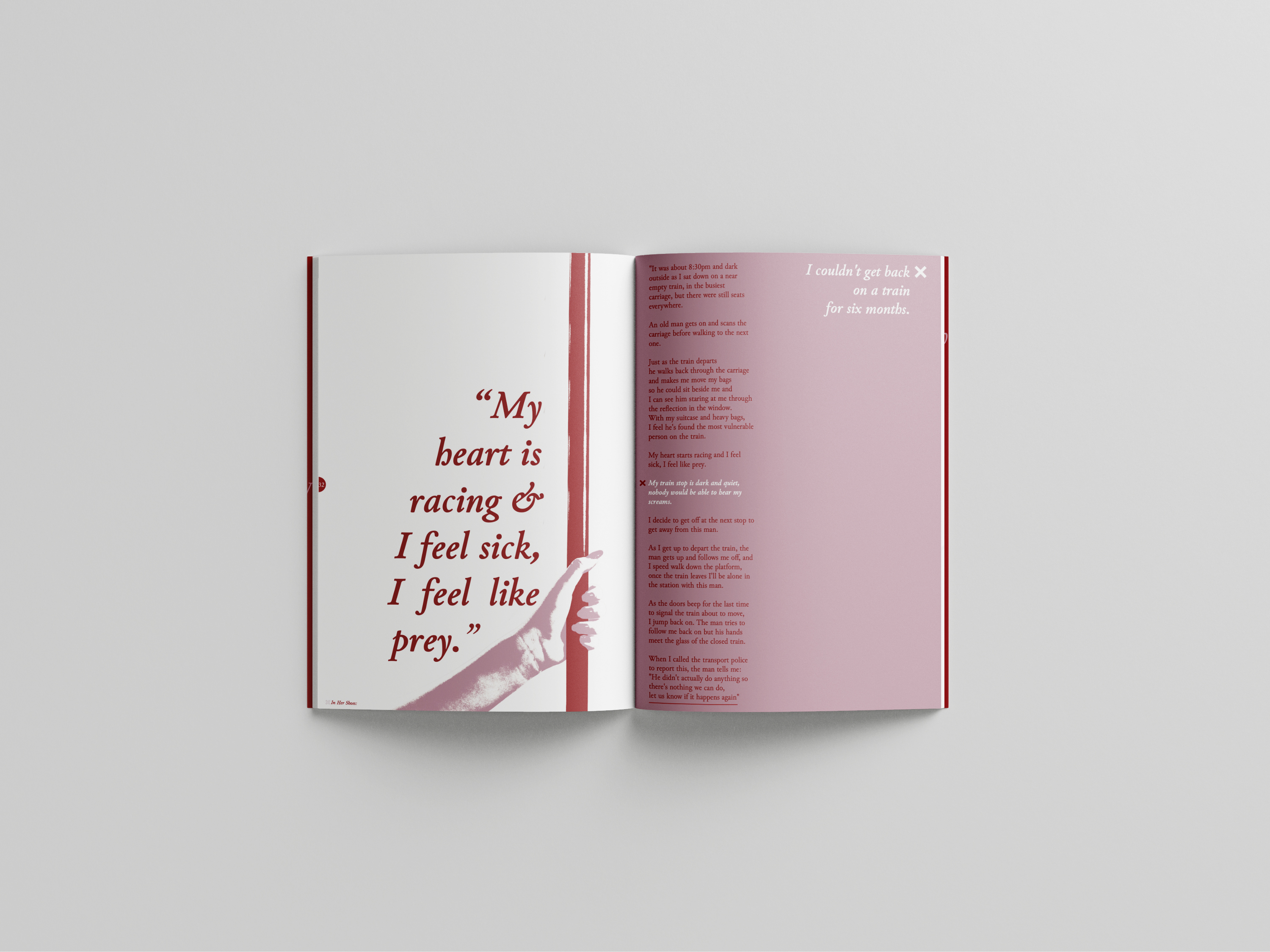
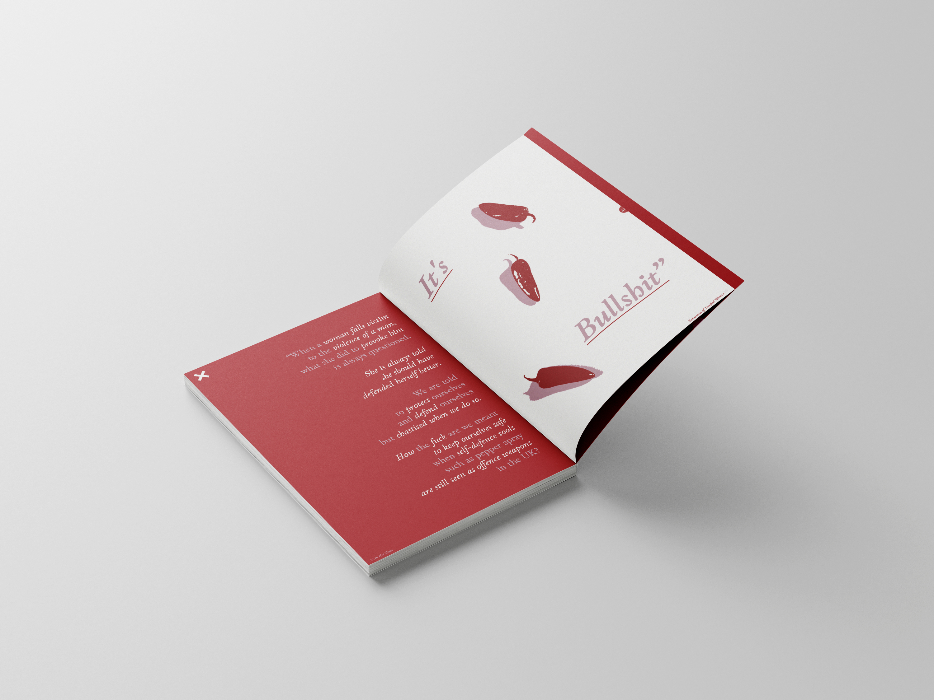
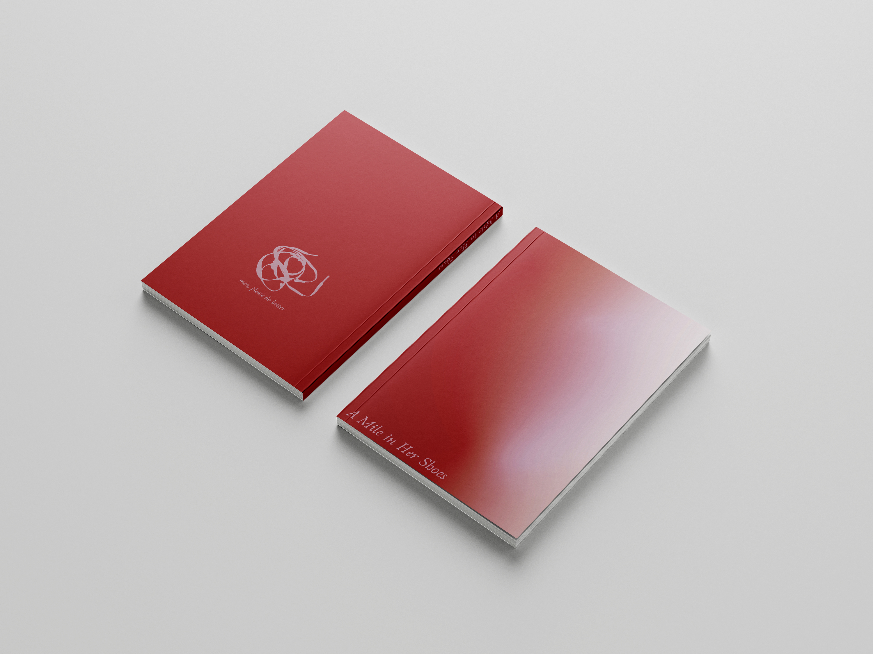
Mile in Her Shoes
The death of Sarah Everard this spring highlighted what is, for many women, their deepest fear, and was the catalyst for an outcry of women expressing their horror towards the tragedy, and the fear we collectively live with, at the thought of finding ourselves in a similar position.
This publication combines art directed and edited photography with typographic testimonies from women sharing their experiences and fears being alone and out at night as a woman.


Category ········· Poster, Leaflet
Completed ········· May 2021
Completed ········· May 2021
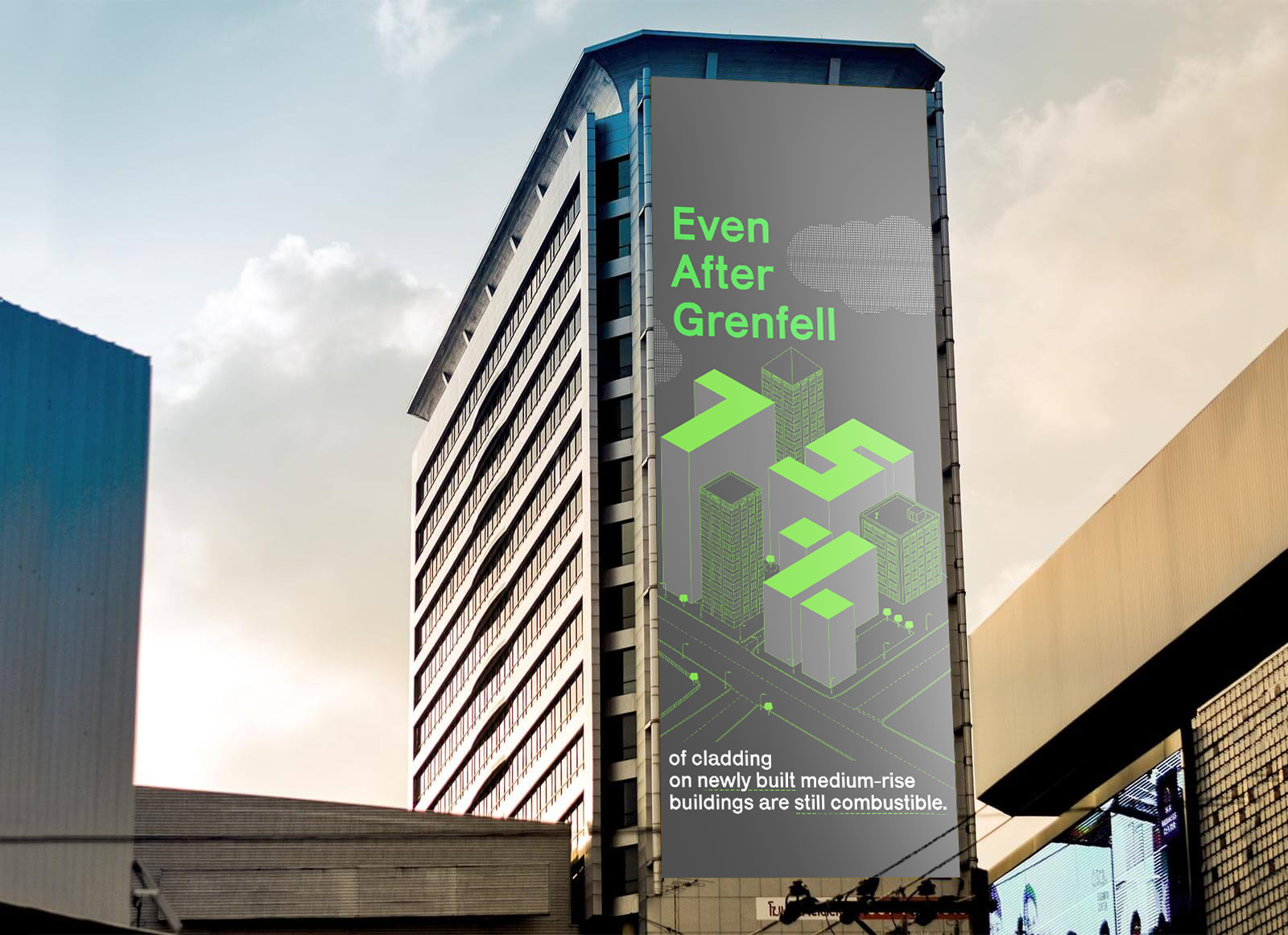
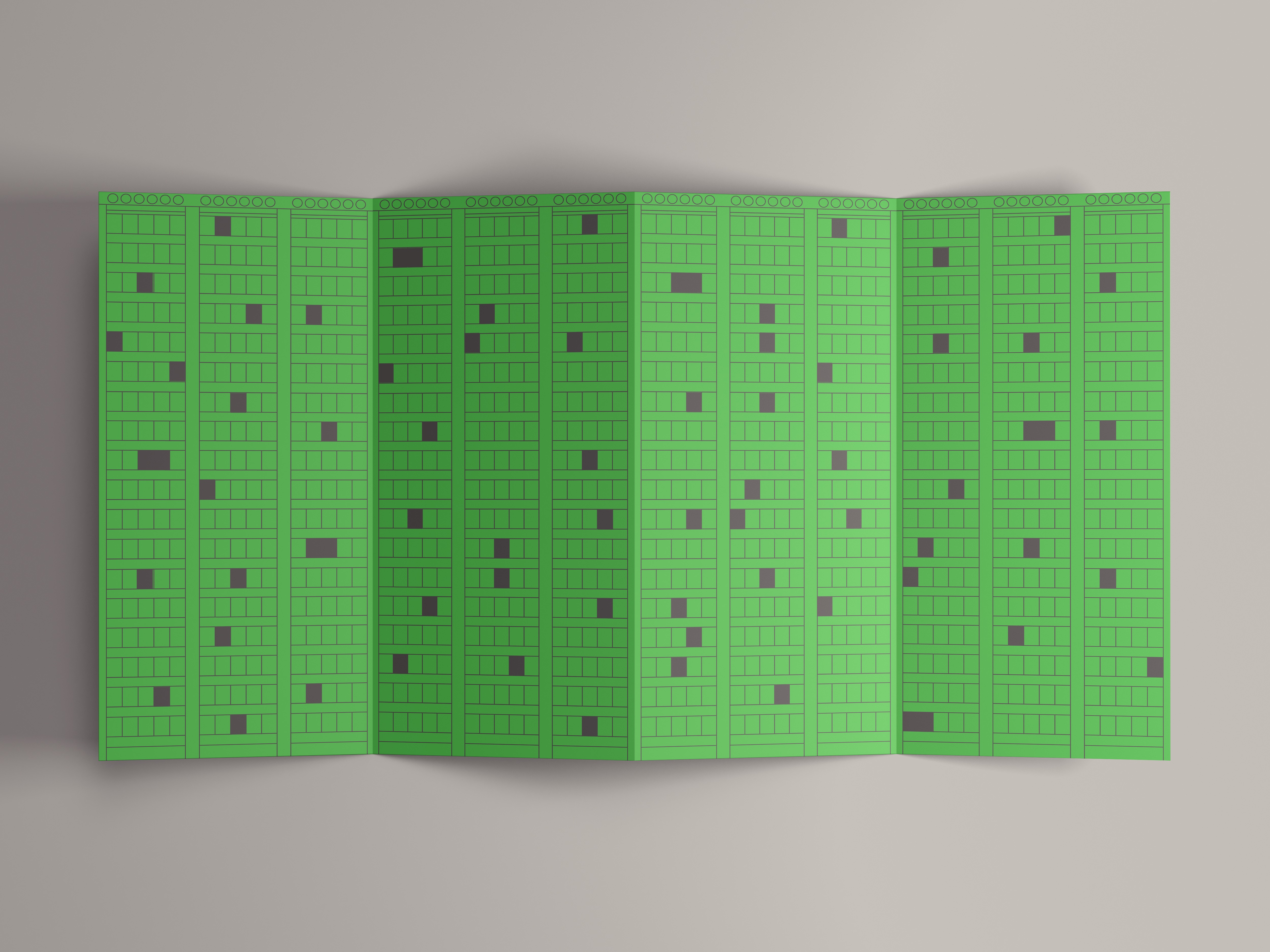

Even After Grenfell
To commemorate and honour the 72 lives lost in Grenfell, for this project I decided to review what has changed four years on from the disaster. The truth was - not enough.
This poster, leaflet combination is designed to demonstrate that not enough has been done to prevent this disaster from reoccurring.
The leaflet is designed to fold and stand up as a model of the tower, pre-disaster, with 72 blacked out windows for the 72 lives lost, whilst the poster is designed for large scale viewing, blown up to billboard sizing.
Category ········· Poster
Completed ········· December 2020
Completed ········· December 2020
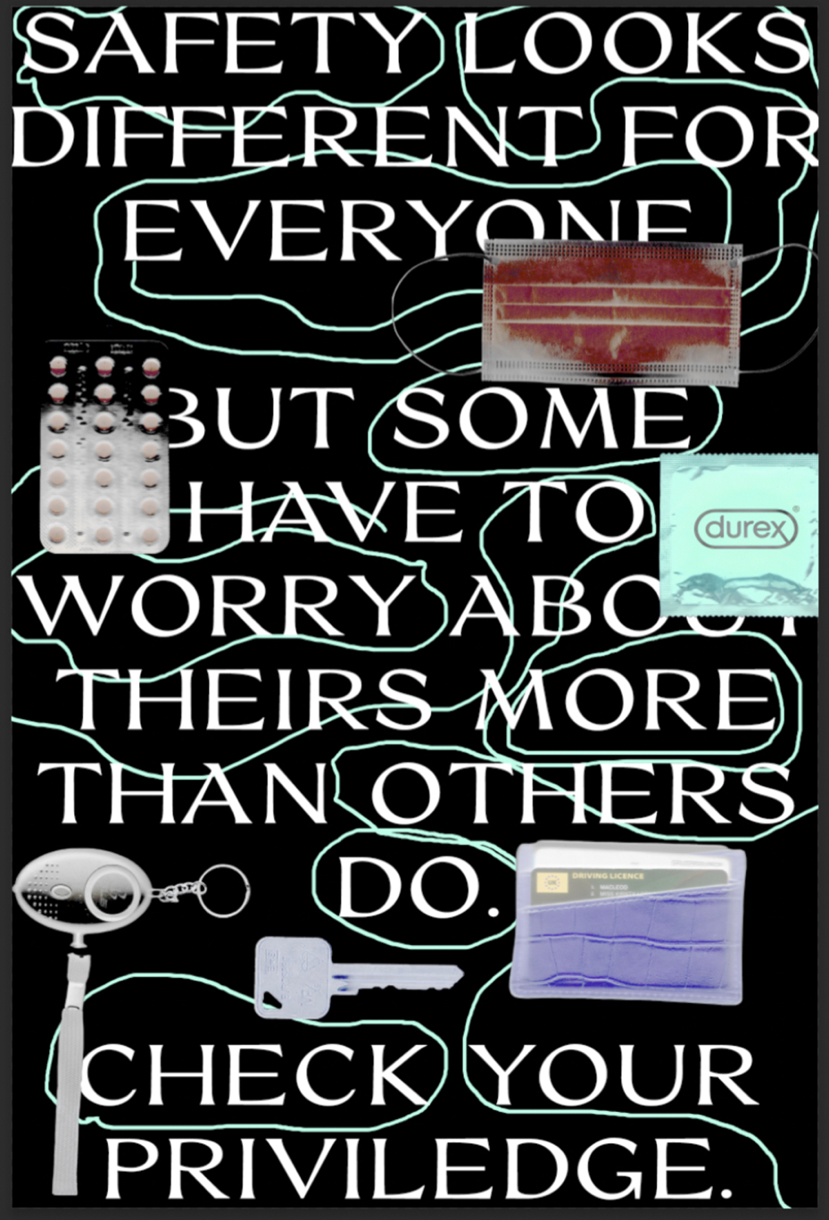
Objects of Safety
This poster uses scanography to document everyday objects a person may carry around for safety.
As the text suggests, everyone’s version of safety looks different, but this poster aims to encourage its viewers to consider about just how much thought for their safety goes into their choices of belongings to carry around with them.
Is it less than in this poster, is it more?
Category ········· Poster, Leaflet
Completed ········· January 2021
Completed ········· January 2021
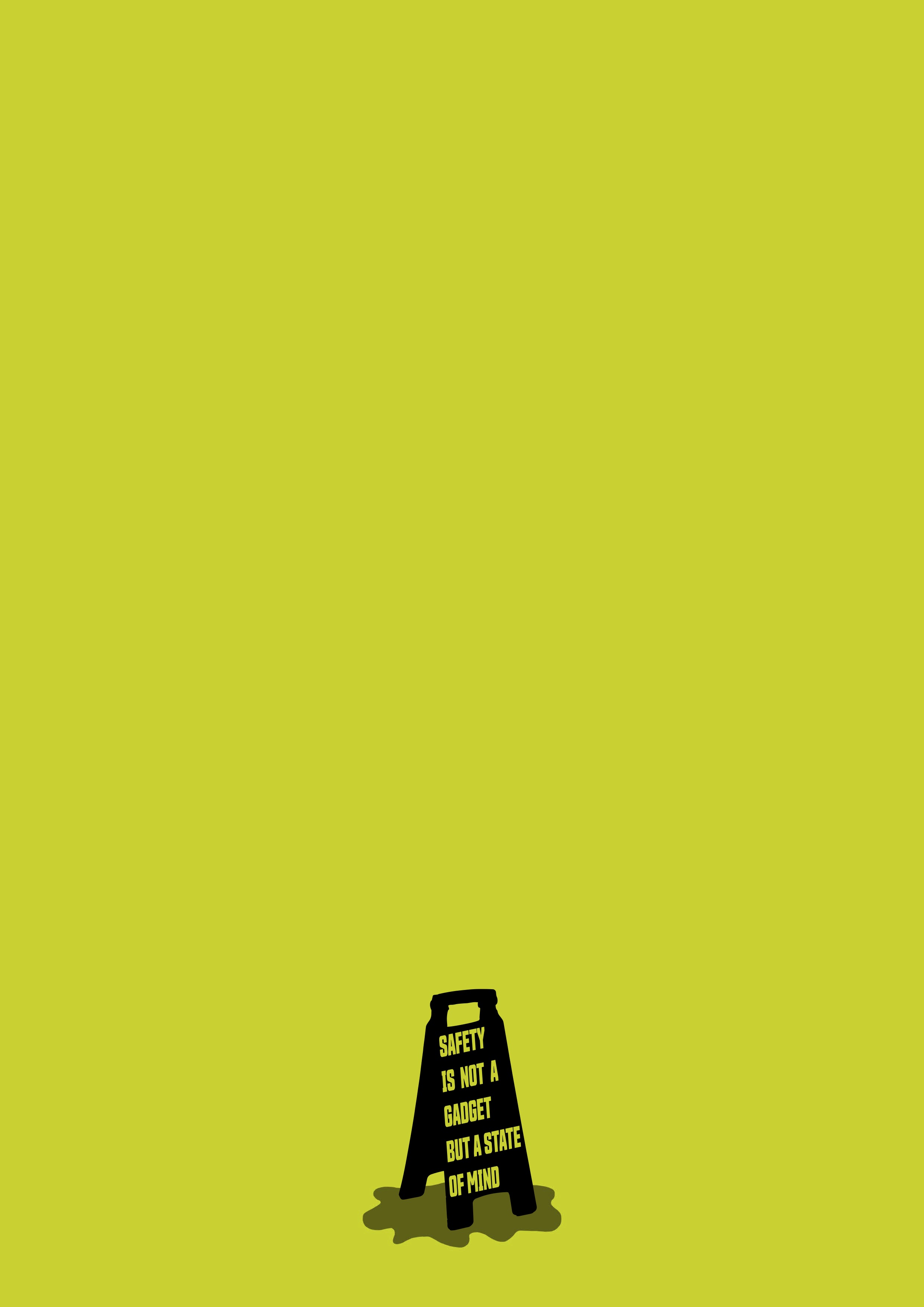
A State of Mind
A simple poster with some food for thought on the theme of safety. Designed to be large scale, with the wet-floor sign to scale.
Category ········· Poster
Completed ········· May 2021
Completed ········· May 2021
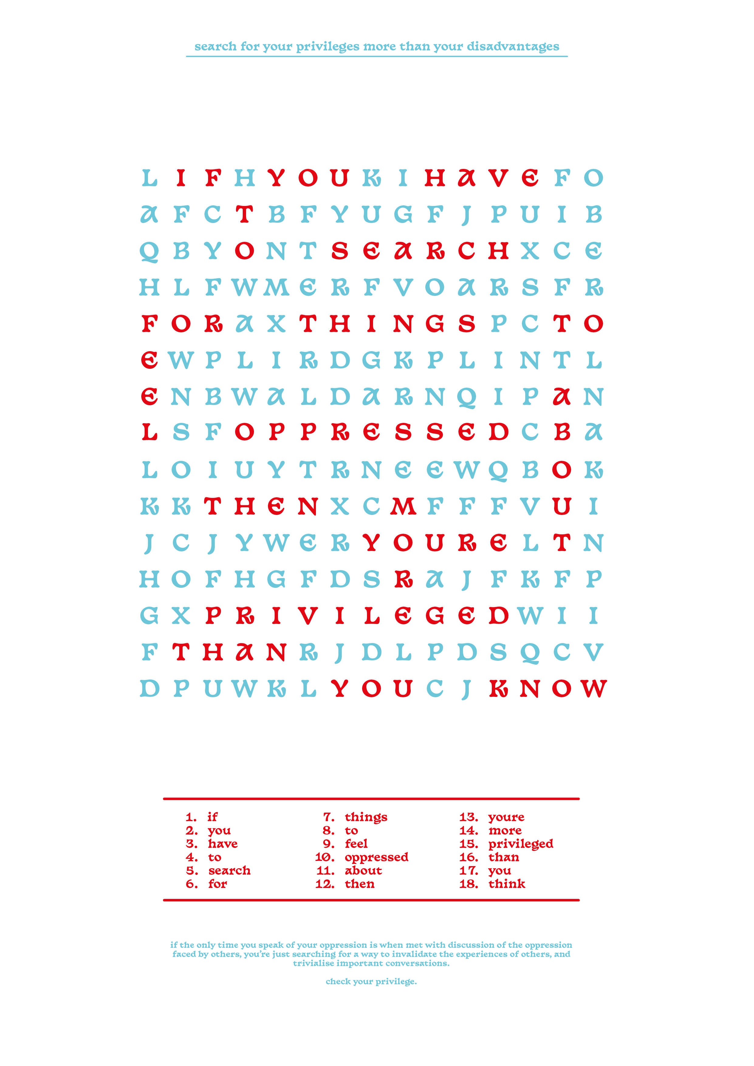
Perspectives on Privilege
Extremely relevant to the current times, these posters individually target those who feel threatened by and aim to hinder conversations on oppression and equality.
Both are interactive and designed for an exhibition style viewing experience.
These pieces are designed for viewing with a red lens to reveal the hidden message.

Category ········· Poster, Typography
Completed ········· March 2021
Completed ········· March 2021

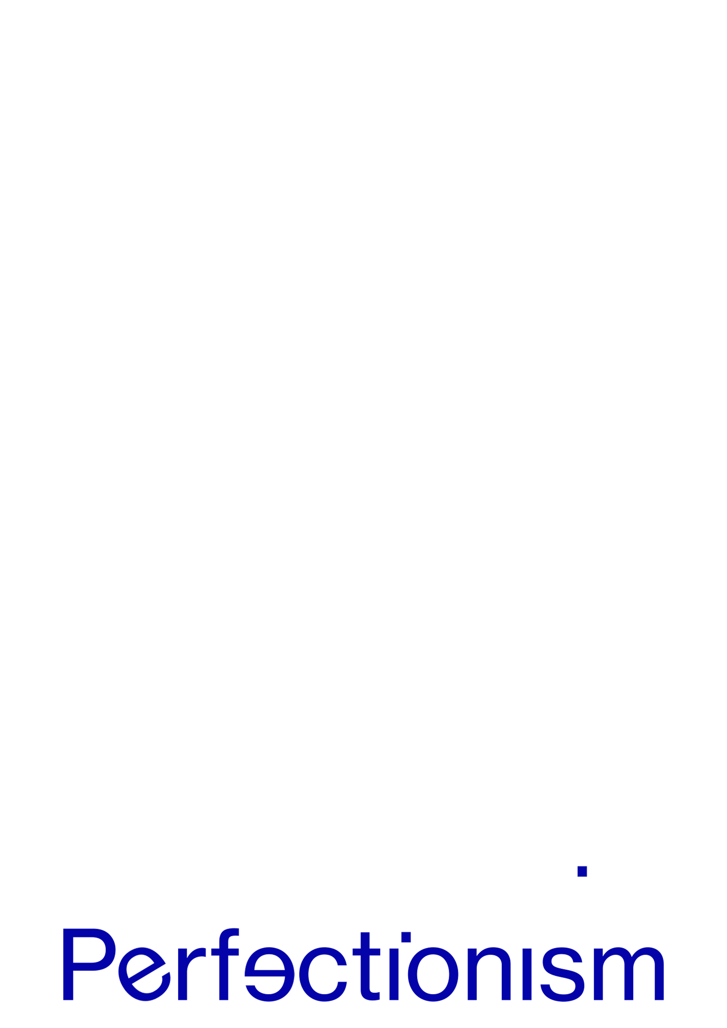
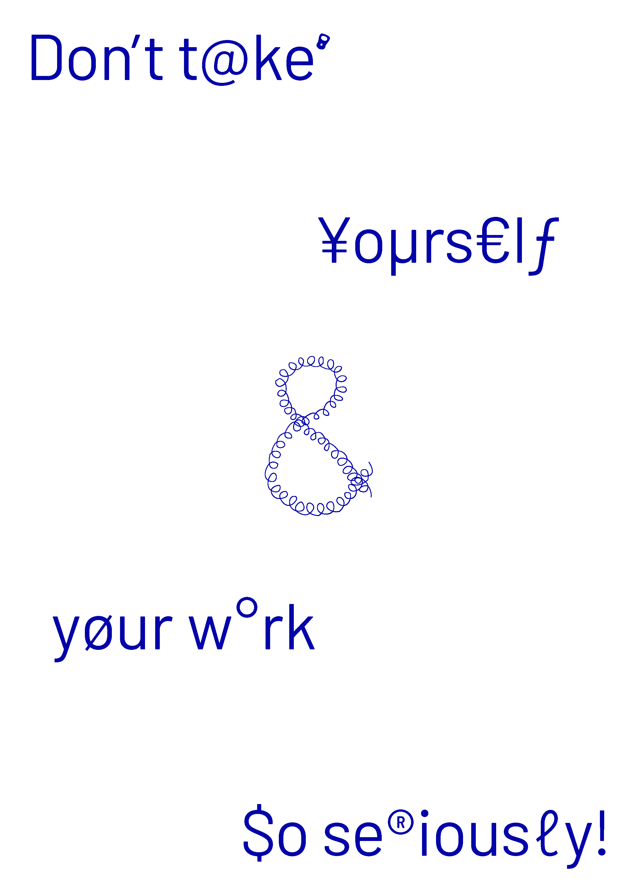
Fears and Limitations
A short poster series on experiences as a designer, of collective fears we face.
Namely, imposter syndrome and perfectionism, and offering a solution for these fears. combining simple imagery with playful typography.
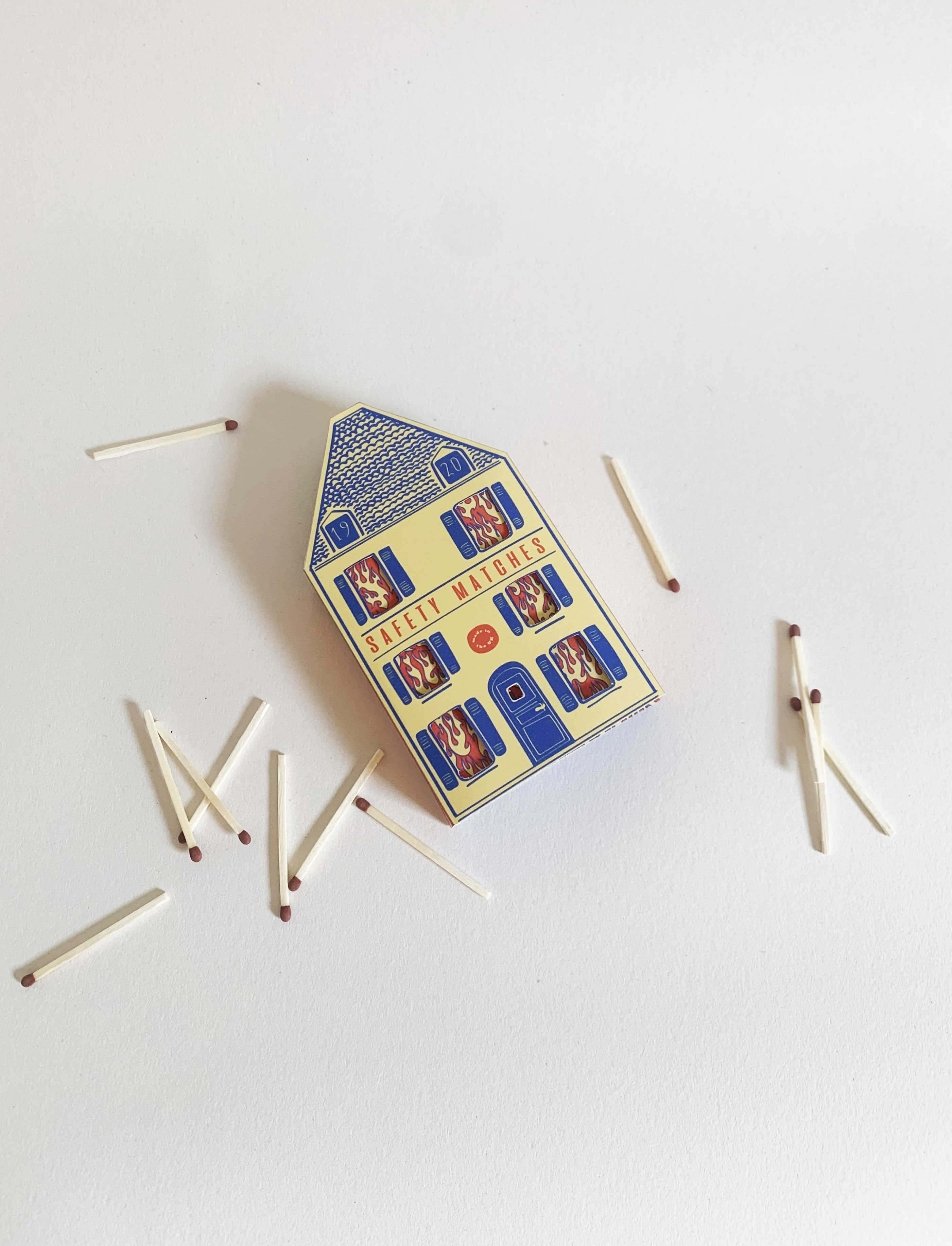
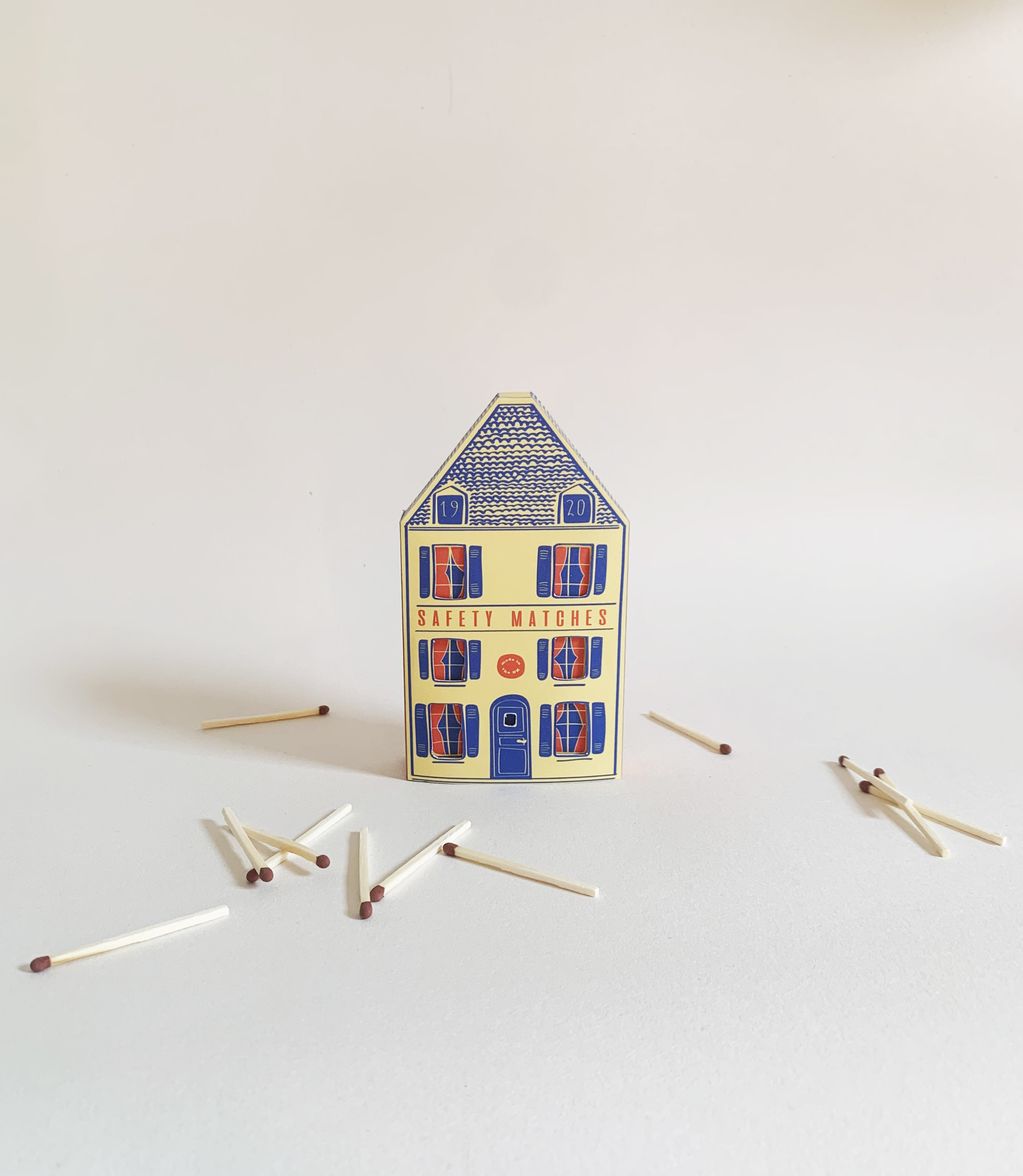
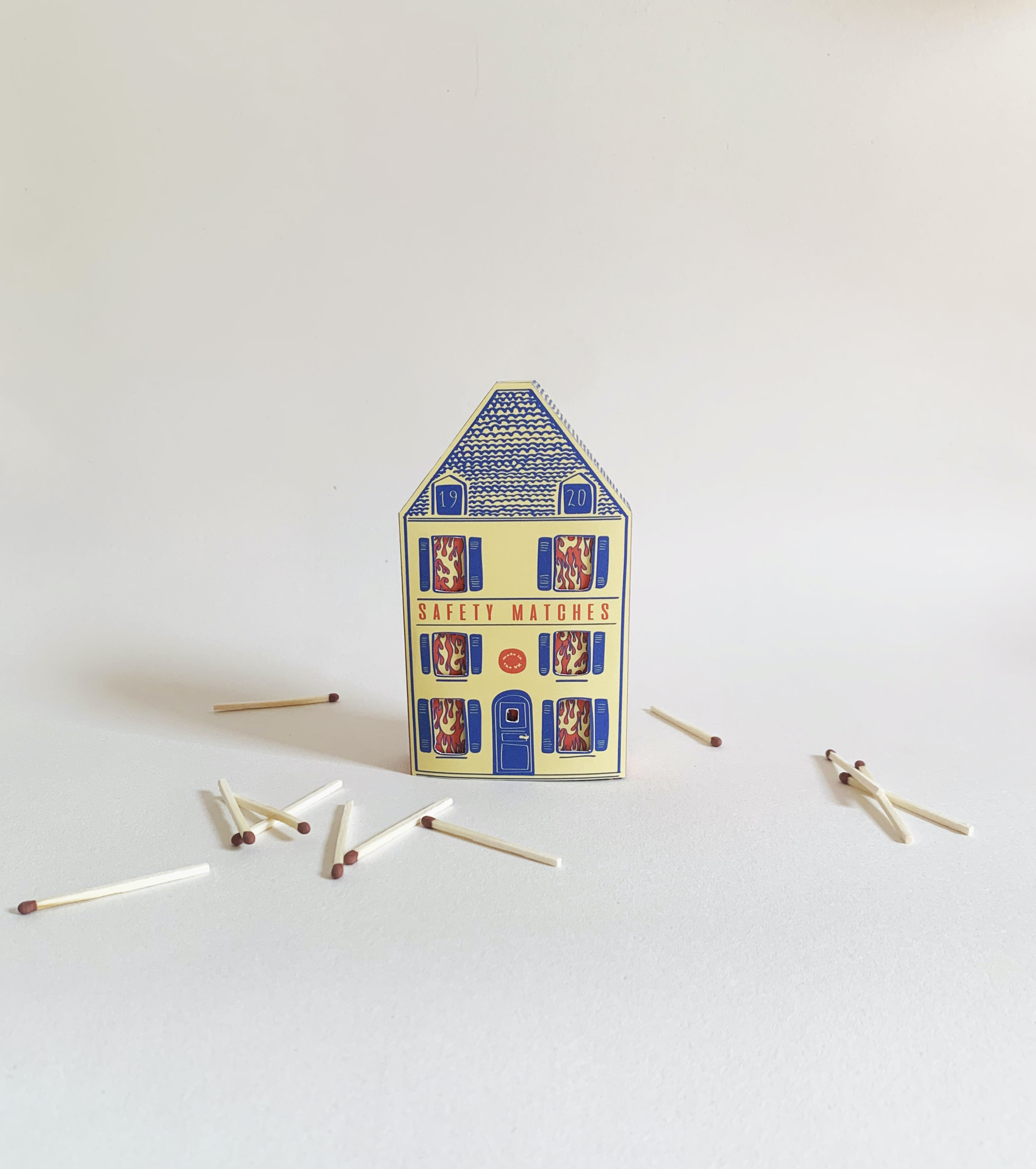
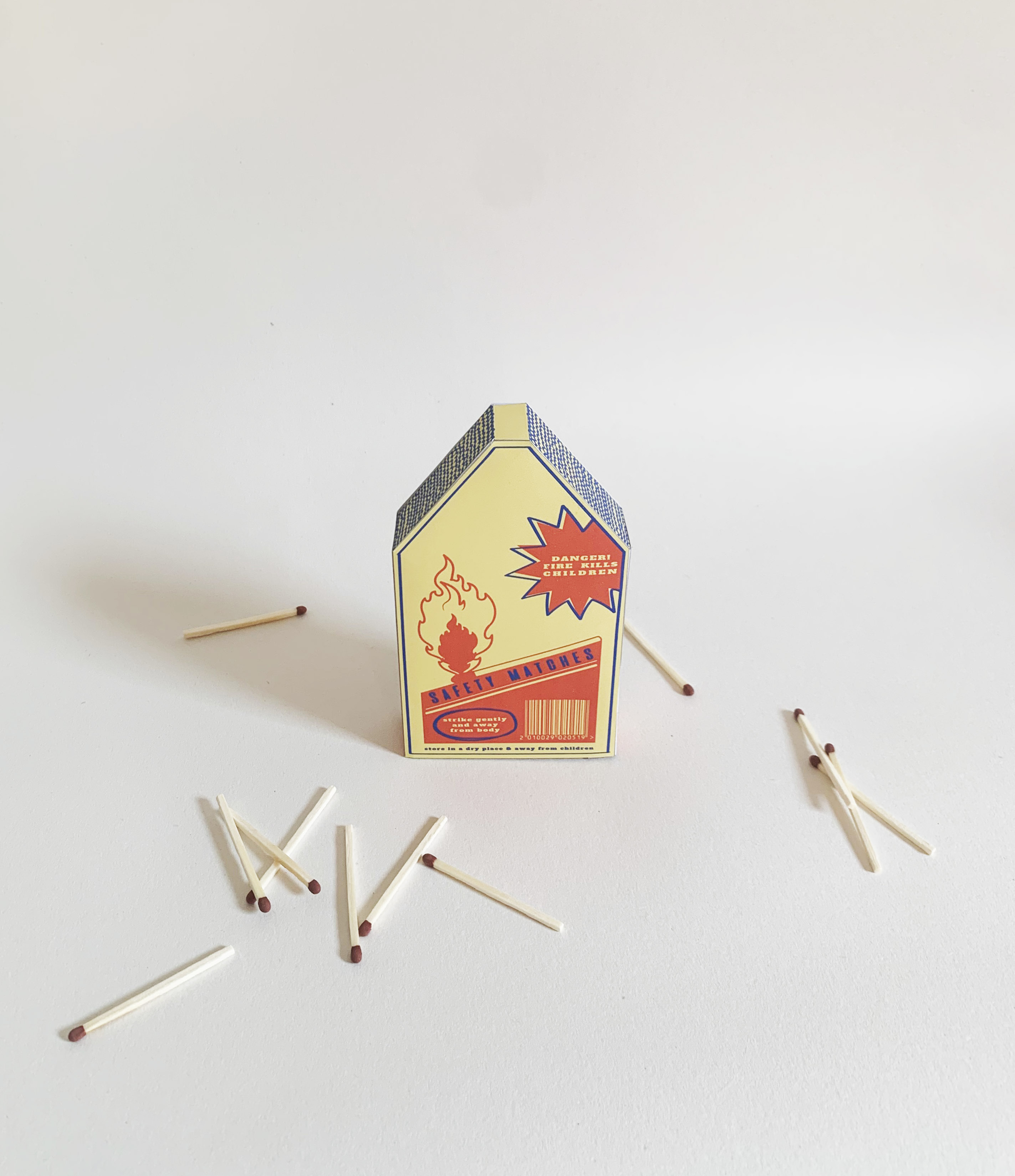
Category ········· 3D, Packaging
Completed ········· December 2020
Completed ········· December 2020
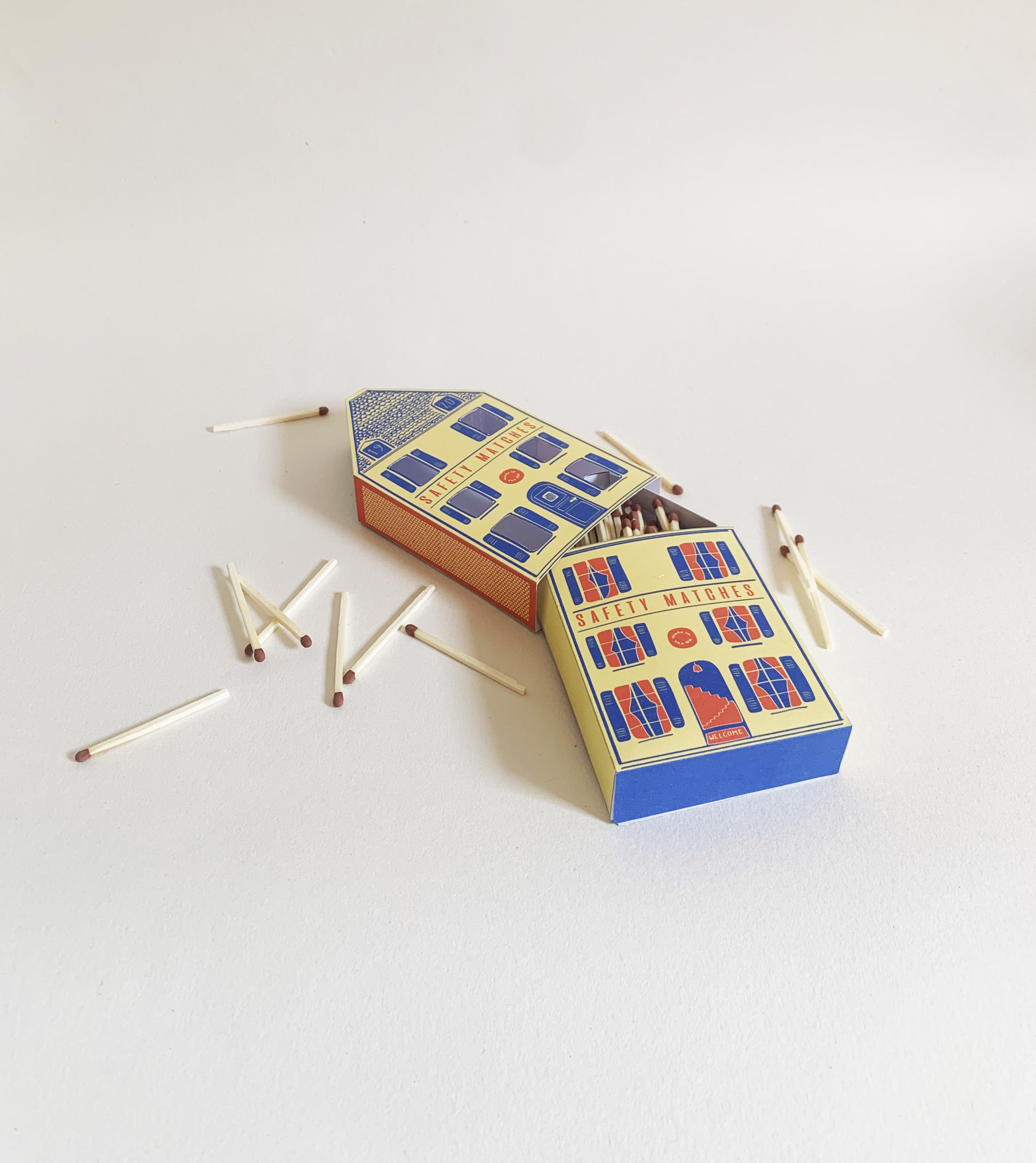
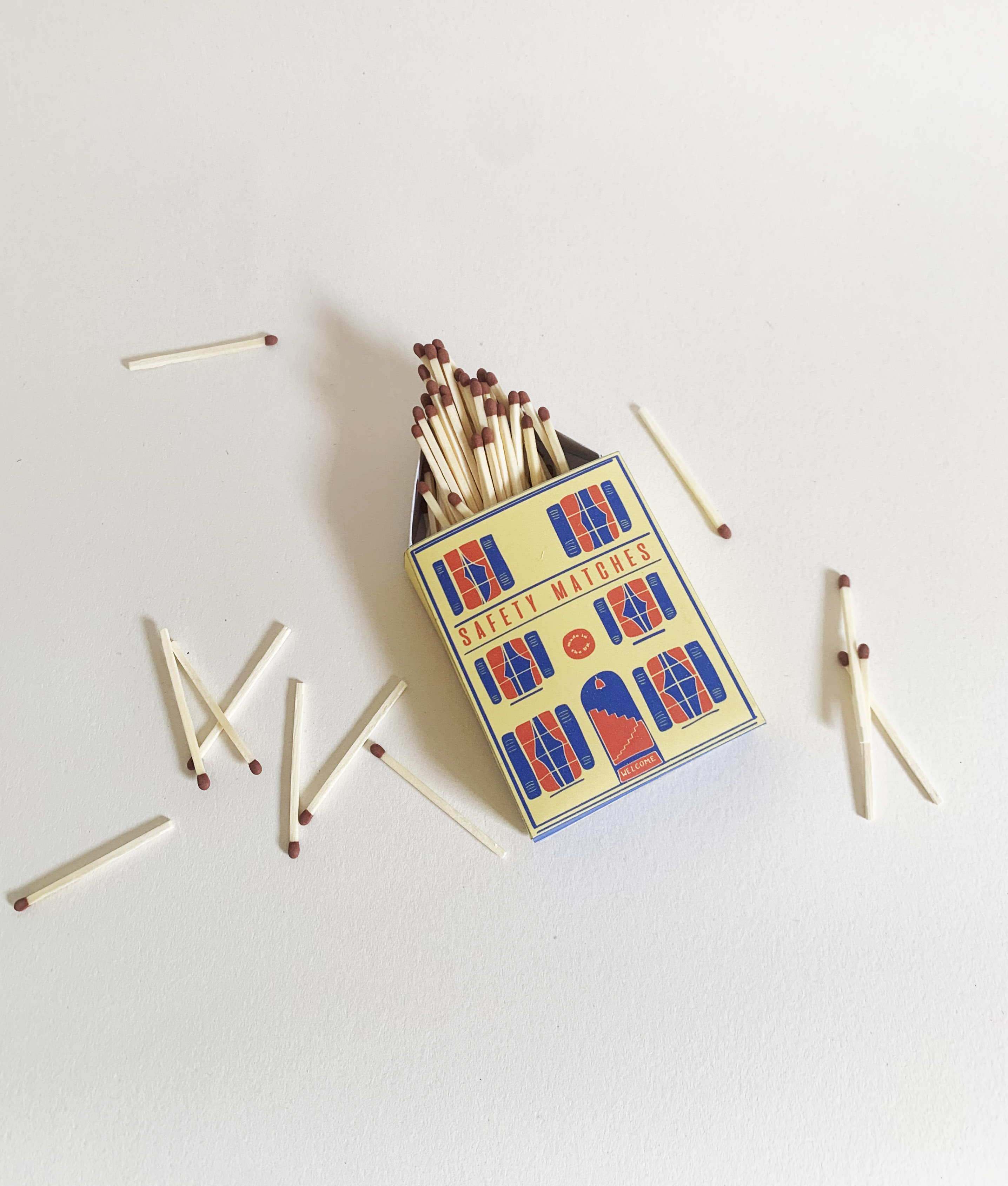
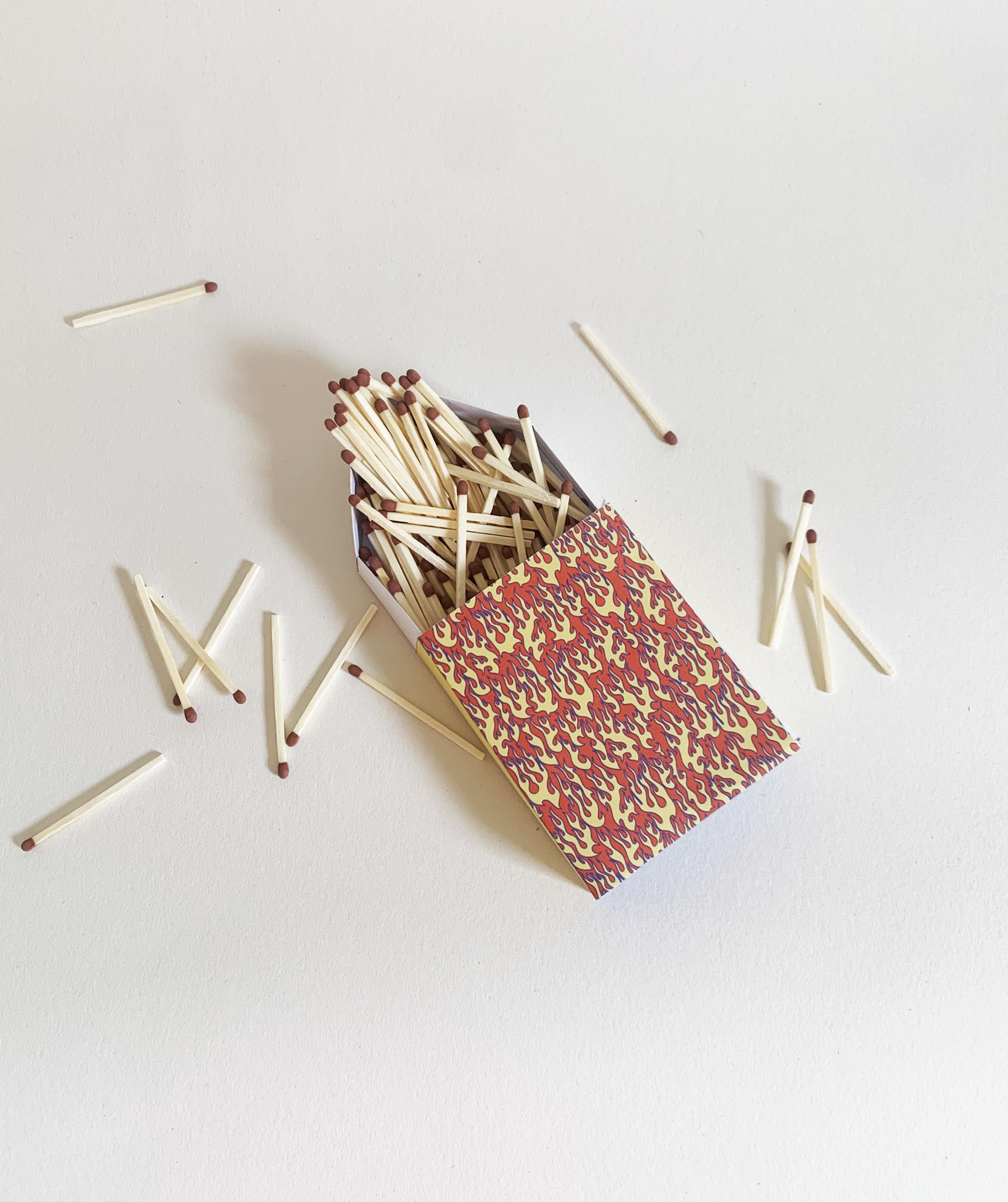
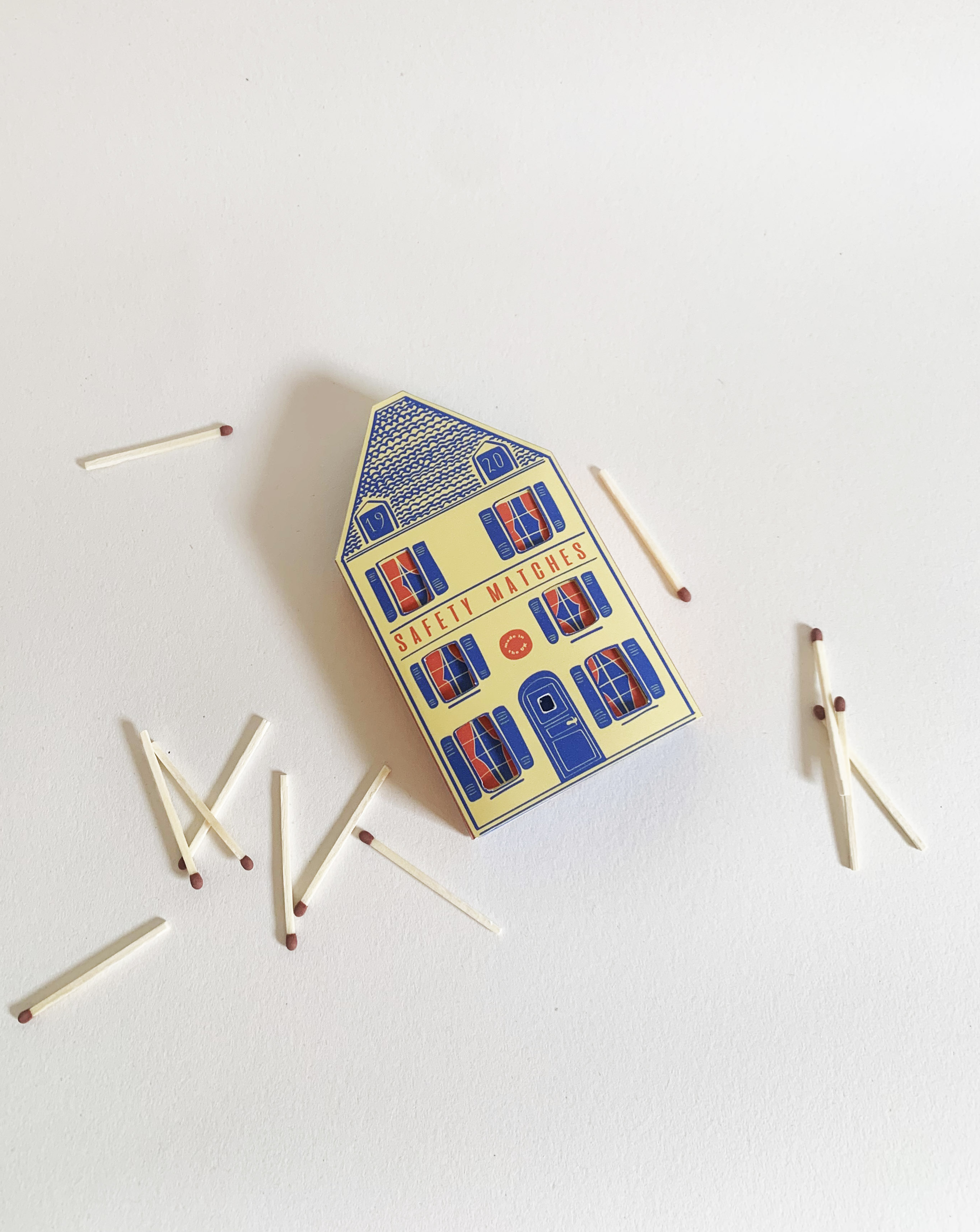
A Souvenir for Your Safety
Another project within the fire safety theme, and this one aims to create a solution to the problem.
I was inspired by vintage matchbox packaging, and the design is combination of illustration and product design.
This matchbox packaging is not only more engaging than typical matchboxes, but holds a message about its dangers, and a more complex design aims to limit a child’s ability to get a hold of its contents.
Category ········· Branding
Completed ········· Ongoing
Completed ········· Ongoing

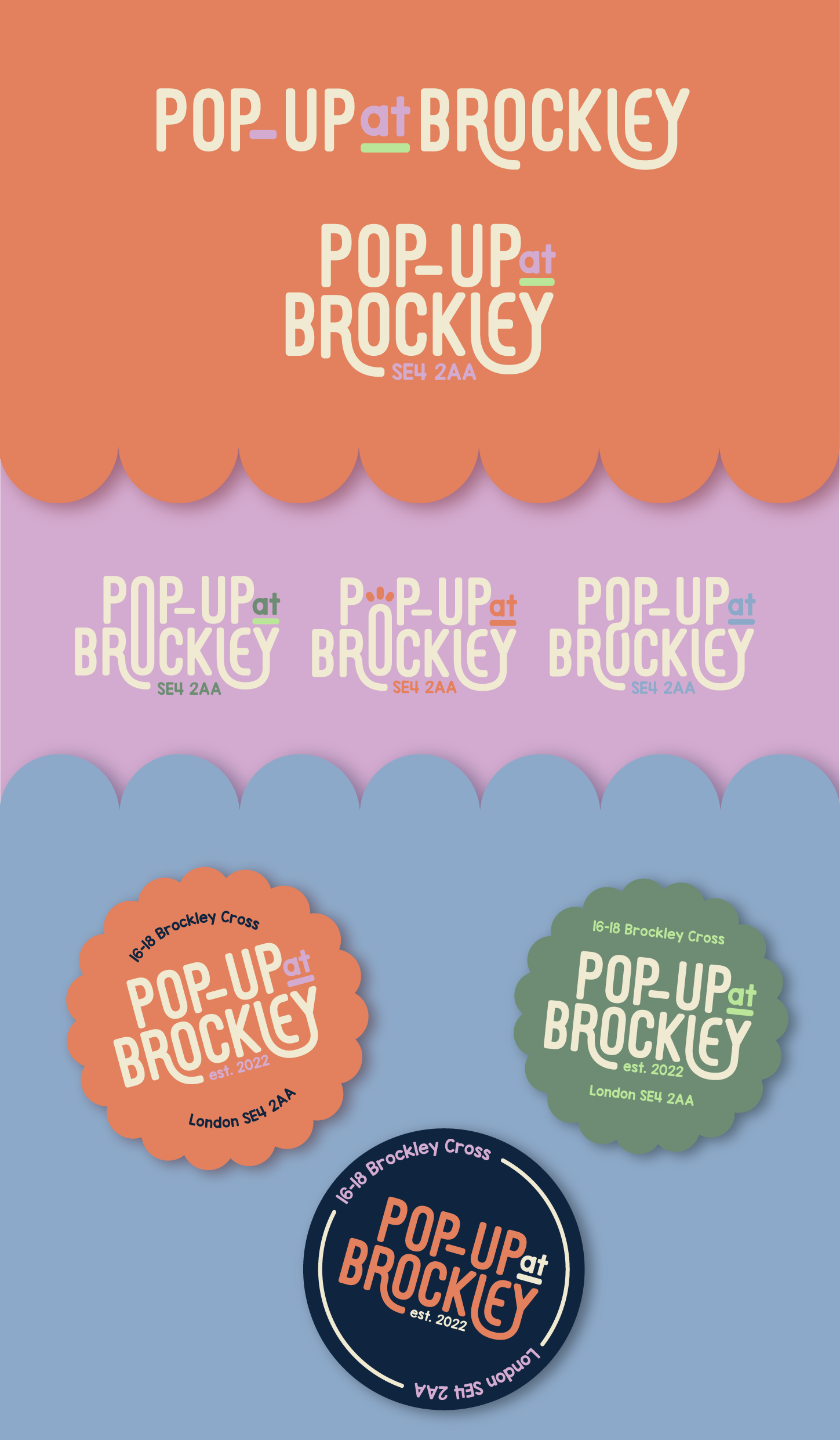

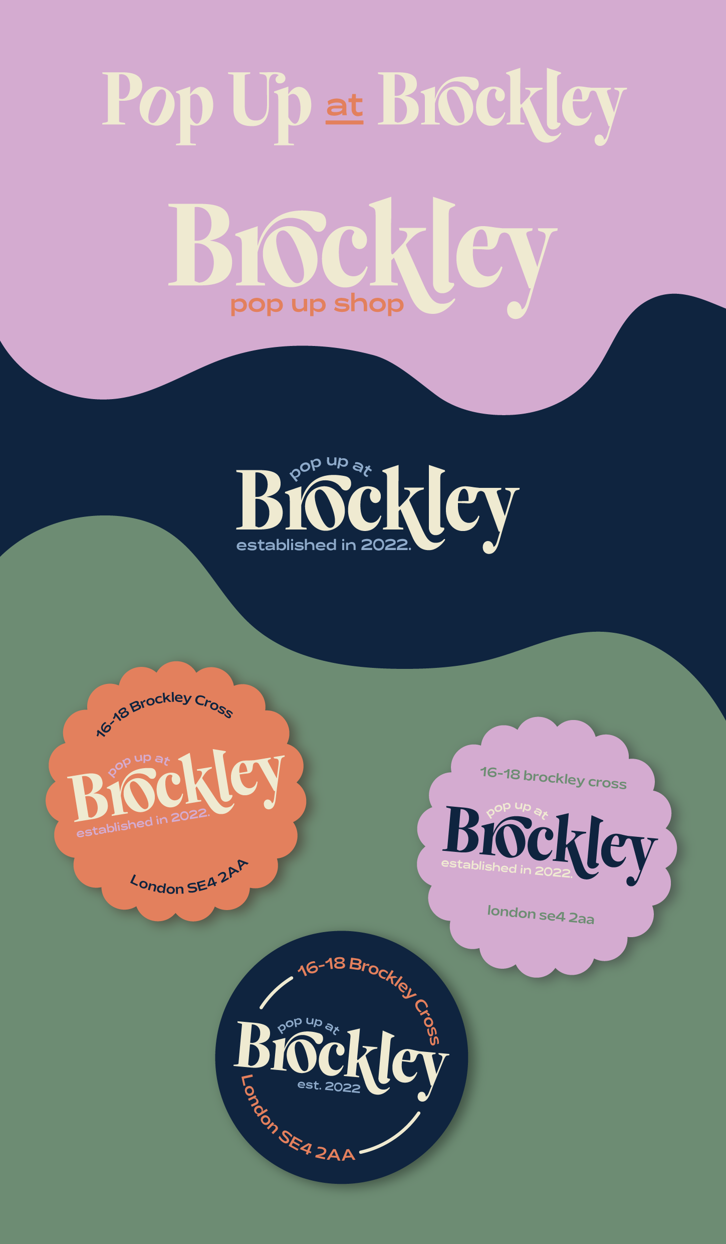
Brockley Pop-up Shop
I was approached by the owner of a london-based pop-up space and asked to help create a stronger presence for the space, through visual identity and branding.
I was given a relatively open brief, with a lot of flexibility. With the key words being classy and minimal, as well as a instructions to maintain a colourful colour palette similar to their existing one, I was aiming to find a happy medium.
This happy medium being an identity that is both inviting and reflective the nature of the space and its function, but also pared back enough that the logos can exist by themselves, without a need for lots of additional branding elements.
I’ve included some of my initial inspiration we discussed, as well as the colour schemes and my concept development for various styles, with various iterations of these logos included to show my process.
Category ········· Logo, Illustration
Completed ······ June 2023
Completed ······ June 2023
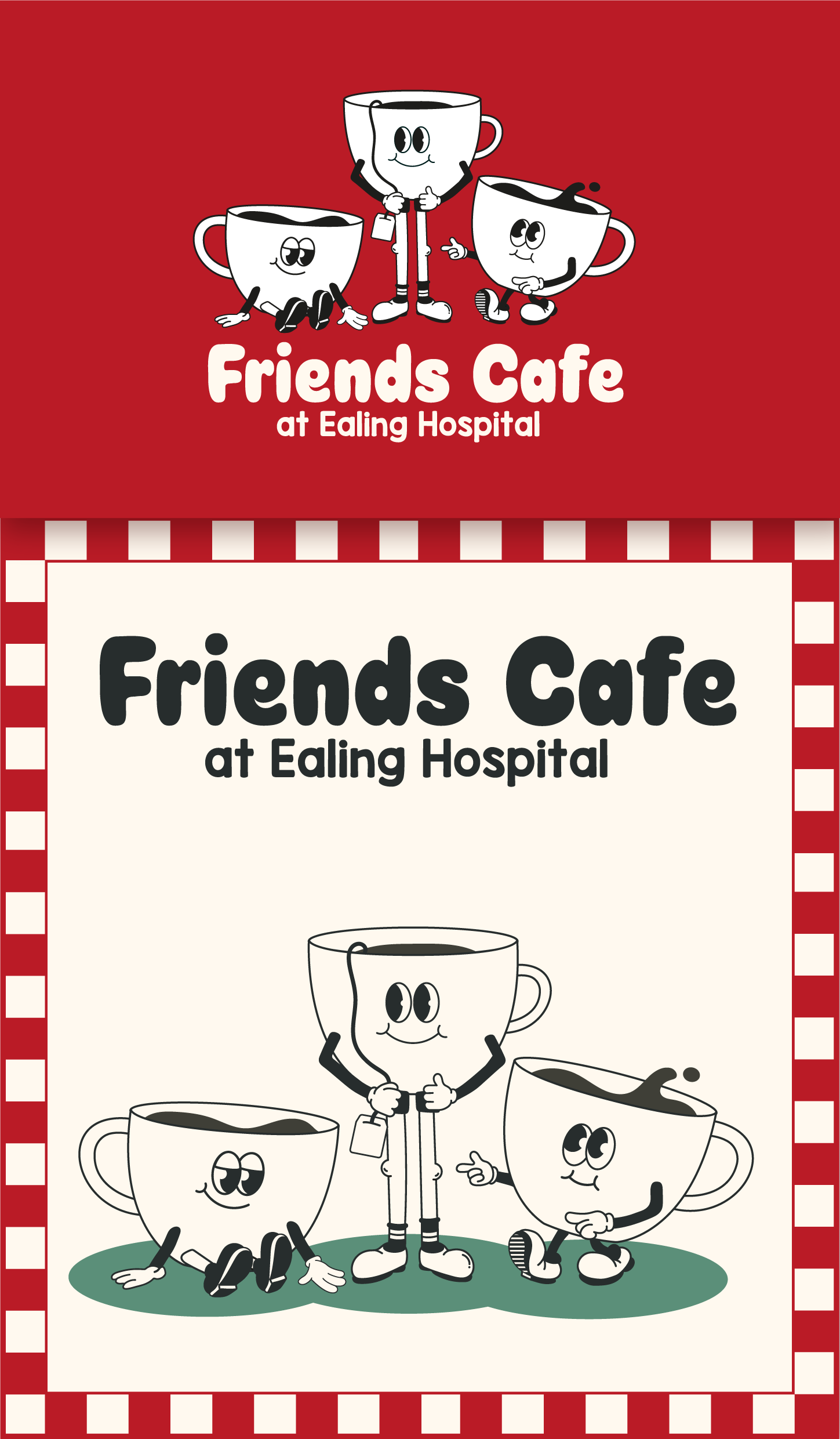
Friends Cafe at Ealing Hospital
Creating a new visual identity for the community-led hospital cafe
I was approached by this organisation to help them to refresh their branding and bring it up to date.
Their colour scheme at that point had been an undefined mix of reds, greens, pinks and shades of white or off-white, with three cartoon cups as their logo, and we decided we would retain some of the essence of the brand, with the inclusion of three cups, whilst creating a more defined colour palette.
We were aiming for a welcoming and youthful feel, so I created two brand concepts, each incorporating the three cups in a different style of illustration, and some inviting typography to go with them.
I have also included some of the materials I developed in line with the branding we decided to go with.Th

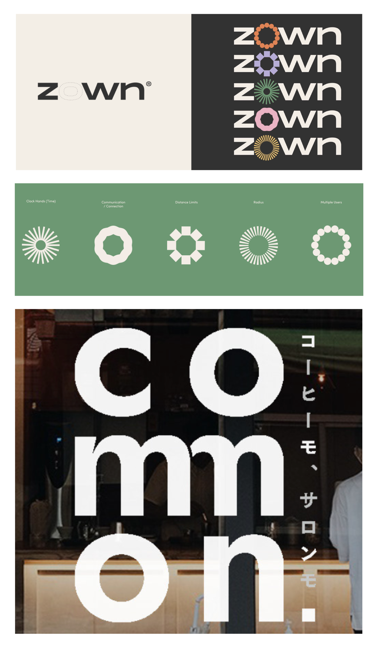
Category ········· Branding
Completed ········· March 2021-April 2023
Completed ········· March 2021-April 2023
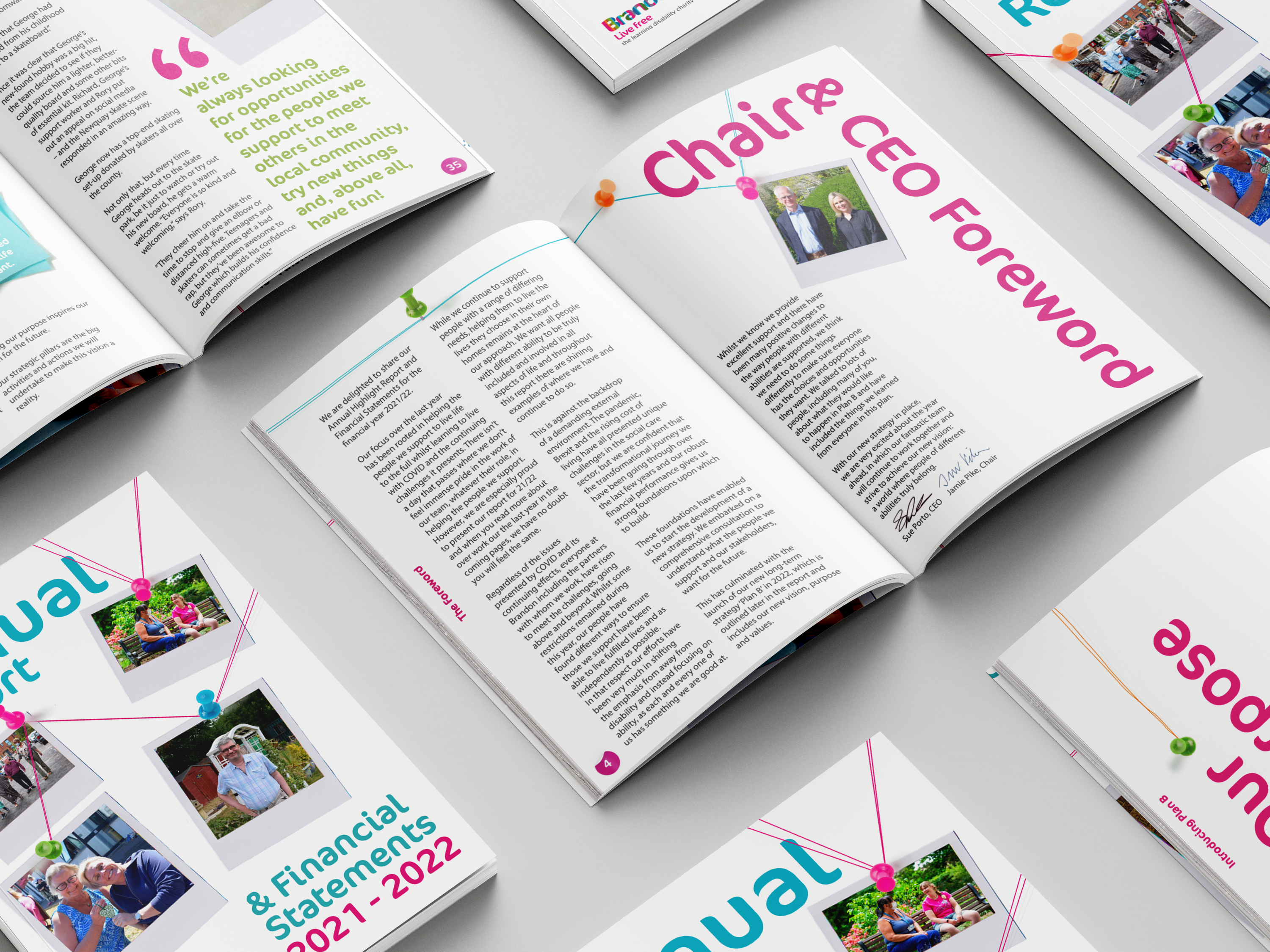
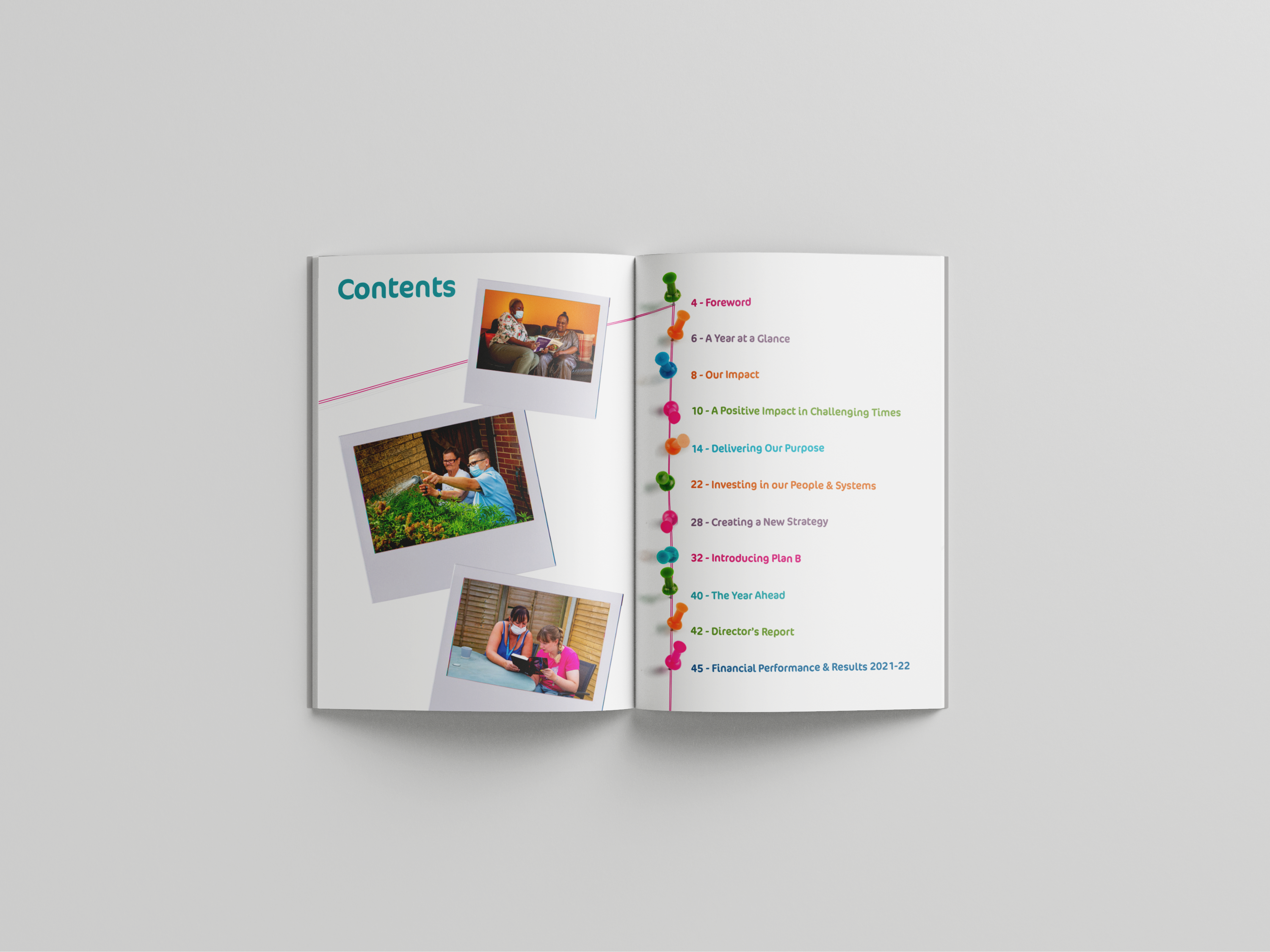
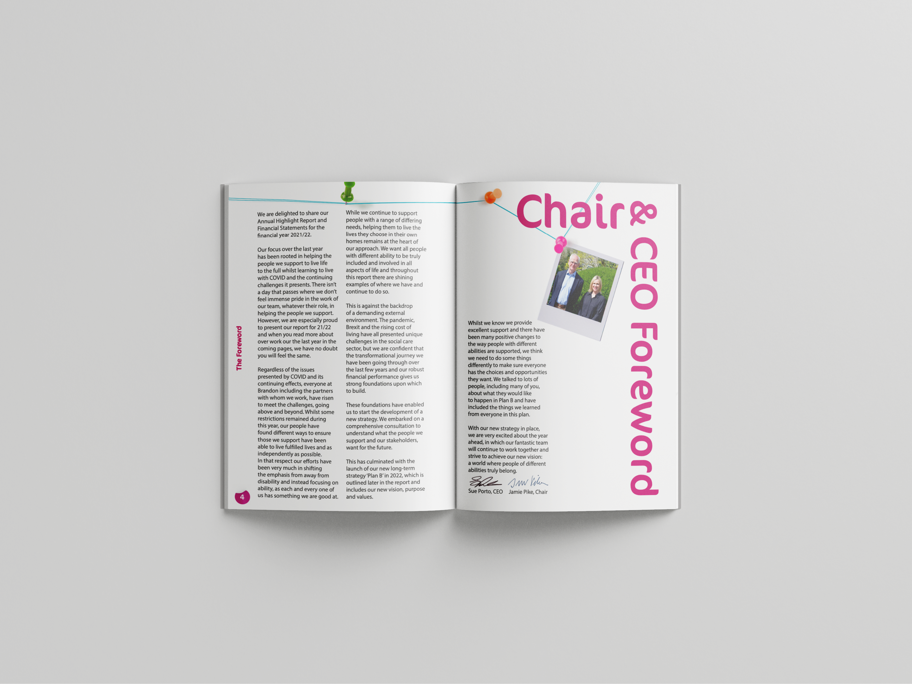
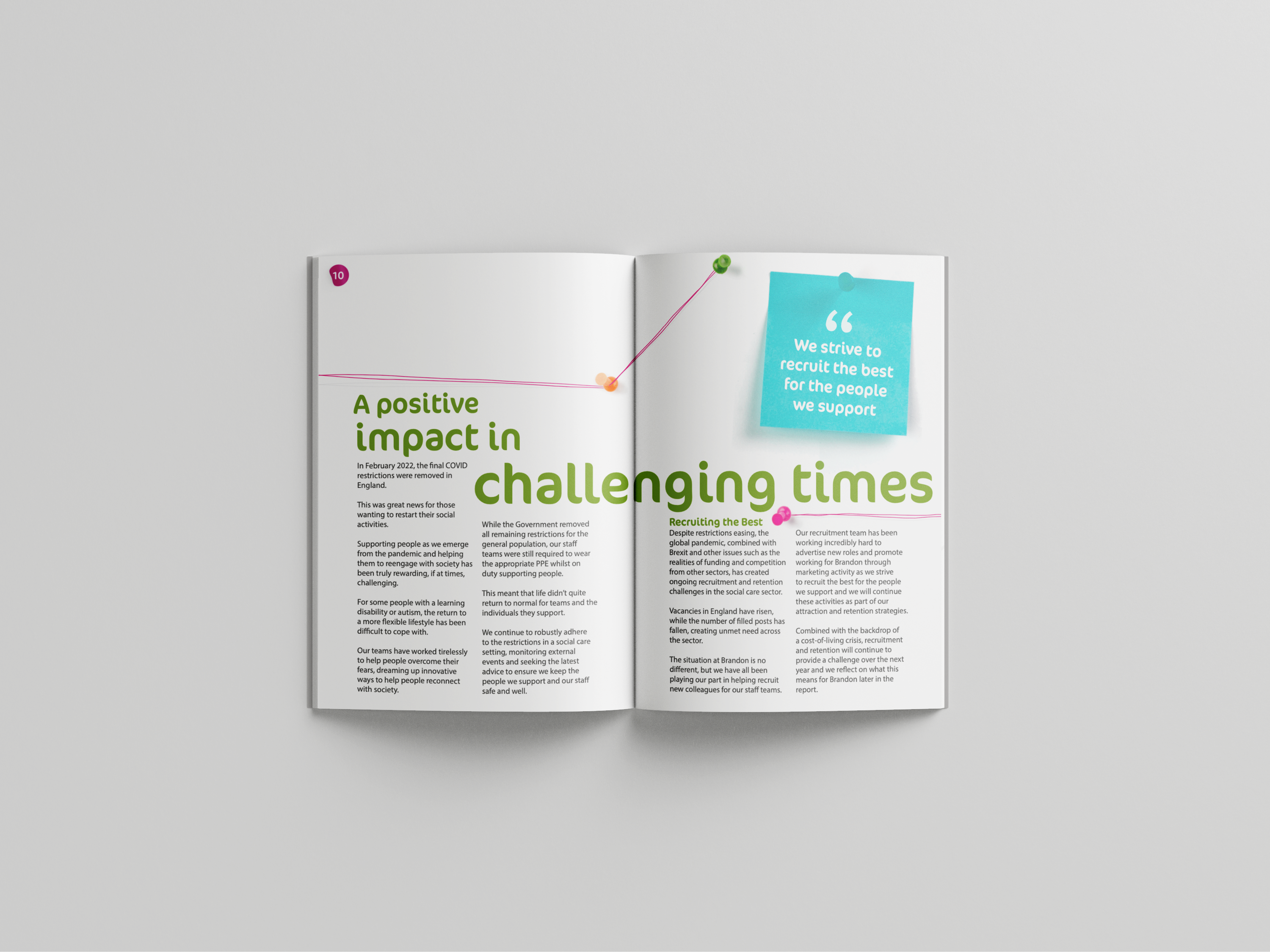
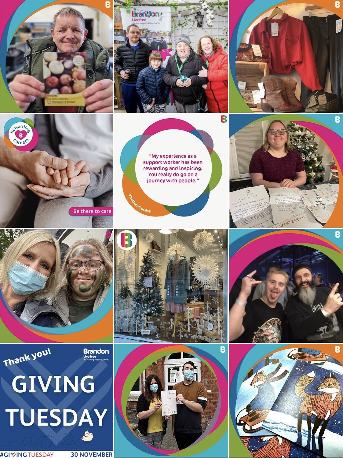
Brandon Trust
A collection of highlights from my time as an intern, and later a Junior Designer at Brandon Trust, a charity that supports adults with learning disabilities and autism
My priority with my work at Brandon Trust was to help create a stronger sense of brand identity.
This identity is centred around accessibility, due to the nature of the organisation, but also simple illustration which aims to help represent those with learning difficulties, who are some of the least-represented in our society.
Category ········· Branding
Completed ········· July 2021
Completed ········· July 2021

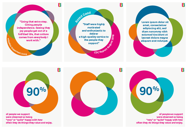
Social Media Suite
Injecting some brand identity into the social media presence of Brandon Trust
To provide a greater sense of flow and consistency to the charity’s instagram page, I created a series of templates, with multiple interchangeable variations of each.
These designs each serve a different purpose and function.
The templates consist of a photo frame design for every day photo posting, a quote design for short pieces of text and a carousel design, which provides space for sharing more information, with these templates created for use across Instagram, Twitter, Facebook and Linkedin, in the appropriate dimensions.
Check out their social media using @brandontrust
Category ········· Logo, Illustration
Completed ······ August 2021
Completed ······ August 2021
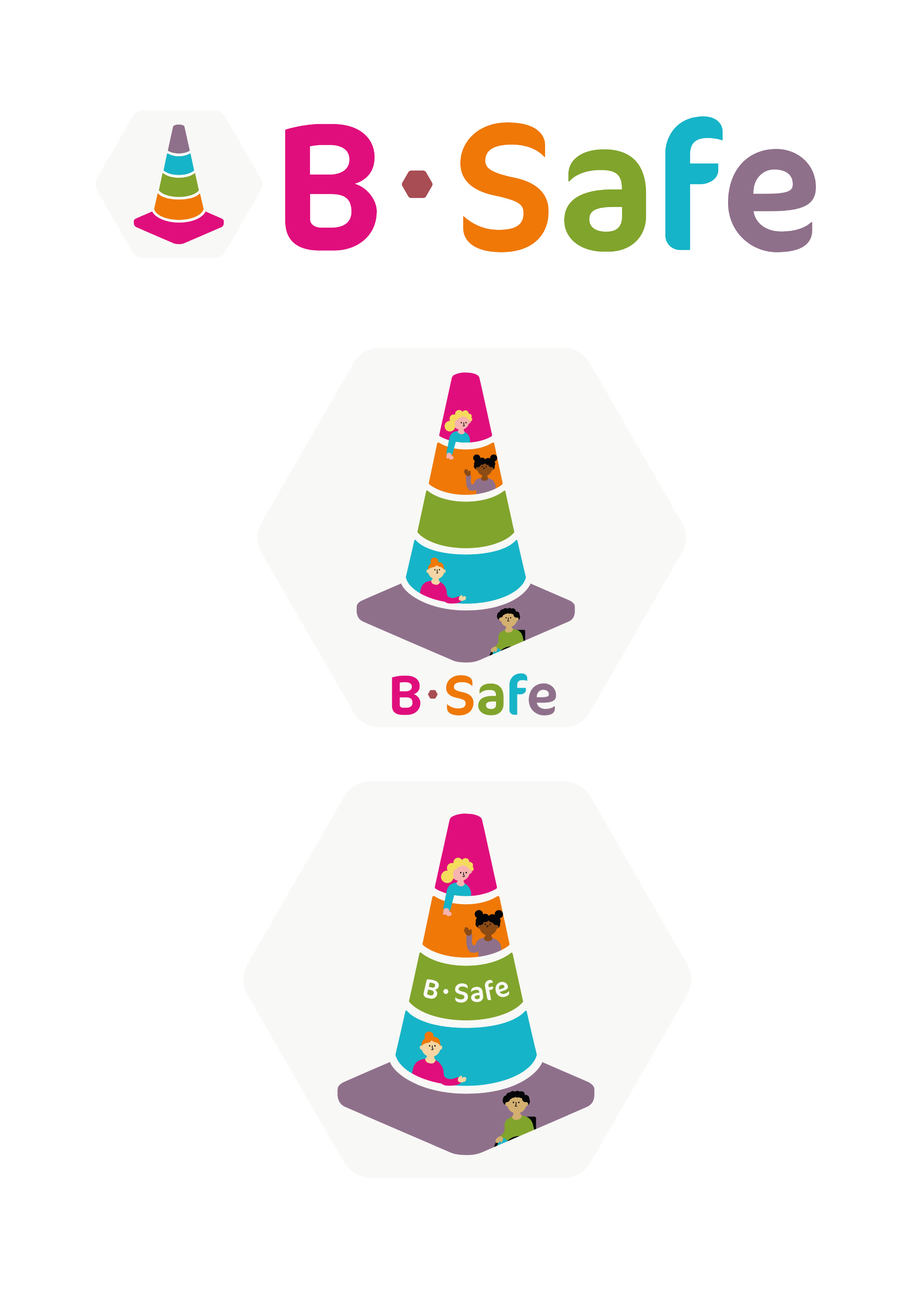
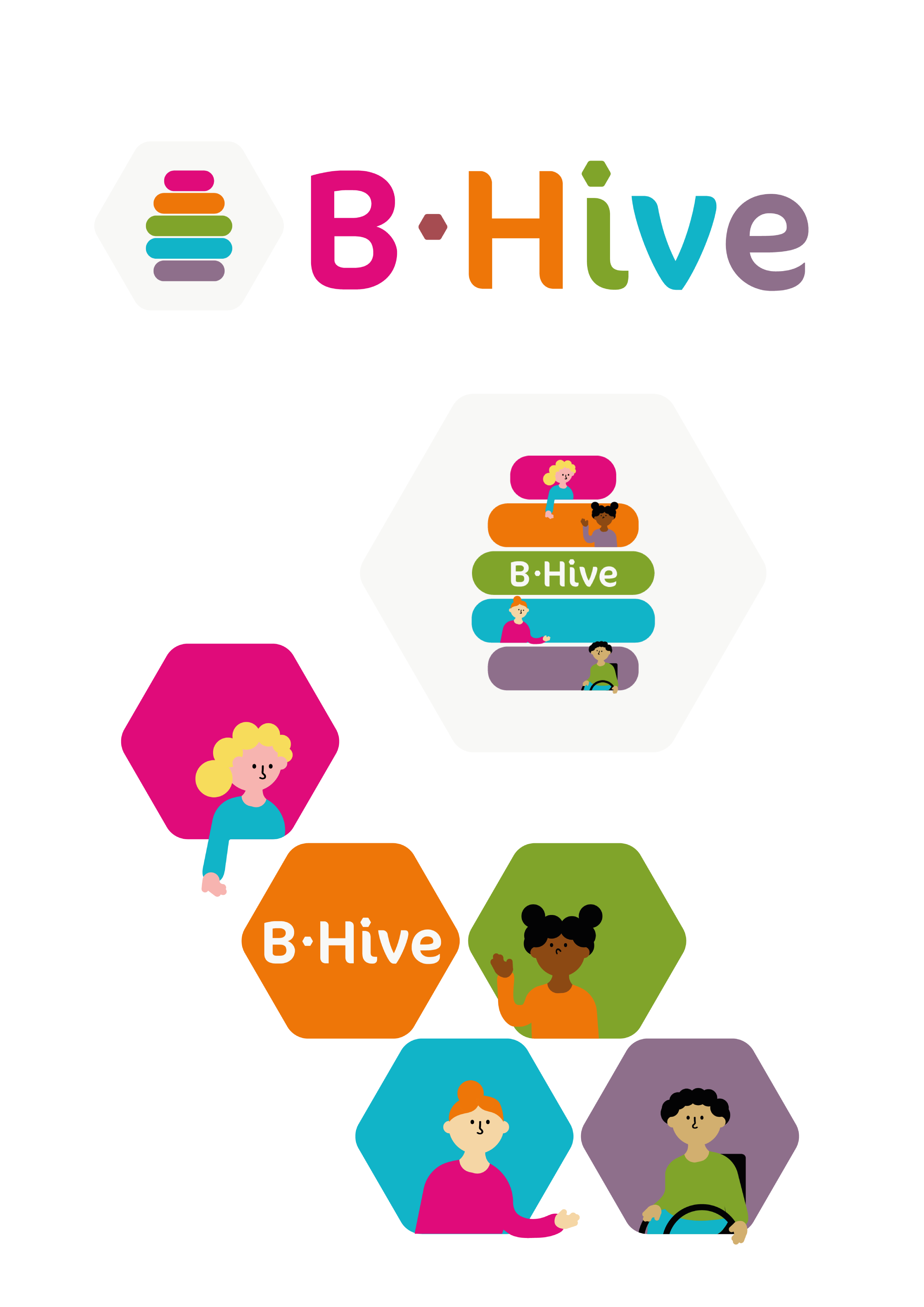
HR System Logos
Creating visual identities for the new HR systems, B-Hive and B-Safe
This project started with B-Hive and later extended into B-Safe.
The intention was to create imagery that provided a subtle nod to the B theme, whilst incorporating the theme of community, inkeeping with existing brand identity I have produced for the charity
I created an abstract bee hive shape for the main logo, and replaced the hyphen and ‘i’ dot with a hexagon shape, as a nod to a honeycomb
The subsequent B-Safe designs were created to closely mirror the style of the B-Hive designs.
Category ········· Video
Completed ········· January 2021
Completed ········· January 2021
'A Sense of Safety'
A conceptual proposal presentation for my final project on the theme of safety.
The visuals explore physical safety whilst alluding to the psychological effects safety measures can also have, presenting as both comforting and suffocatingly oppressive at times.
Click here to open vimeo link ︎
Category ········· Video
Completed ········· June 2021
Completed ········· June 2021
Allow Me to Introduce Myself
A short self-promotional video based on a university workshop conversation, art directed, filmed and edited by me, scripted and narrated by Jenny Li Voon.
Click here to open vimeo link ︎
Category ········· Animation
Completed ········· March 2021
Completed ········· March 2021
Keeping Safe Online
A follow up to my interview publication detailing my parents attempt to keep me online.
With the pandemic leading to a rise in virtual learning, children have never been so likely to have such a broad access to the internet, and the home environment does not always provide the constant monitoring that a classroom would.
This animation aims to teach primary school age children how to keep safe online so that they can make safe decisions for themselves.
Click here to open vimeo link ︎
Category ········· 3D, Photography
Completed ········· March 2021
Completed ········· March 2021
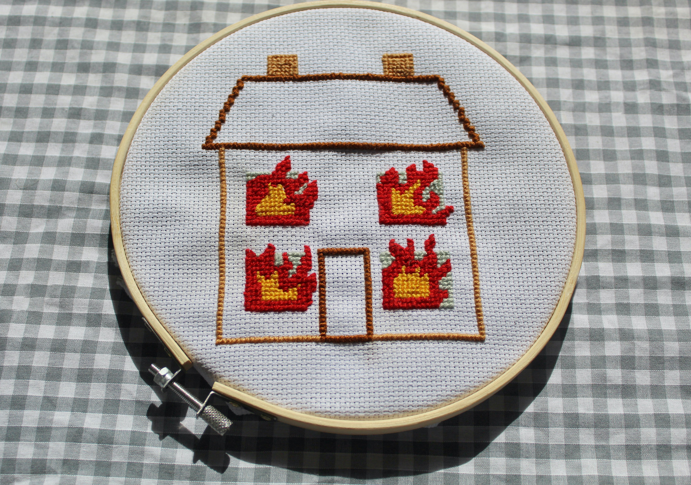
Home is Where the Fire Risk Is
A hand-stitched cross-stitch piece, this piece is a playful take on the vintage style 'Home Sweet Home' cross-stitch art you might find in your grandparent's living room.
It speaks to the dangers that domestic fires pose to households, and how easily things can go wrong.
The design outcome following this manifests as an art directer photograph, using vintage stying to compliment the art style of the piece.

Category ········· Print
Completed ······ January 2021
Completed ······ January 2021


Suffocating Safety
During the pandemic, we have seen growing frustration with measures put in place for our safety. Whilst they might be comforting to some, to others they feel oppressive, and suffocating.
This art directed series realises that visually for its audience.