Category ········· Branding
Completed ········· Ongoing
Completed ········· Ongoing

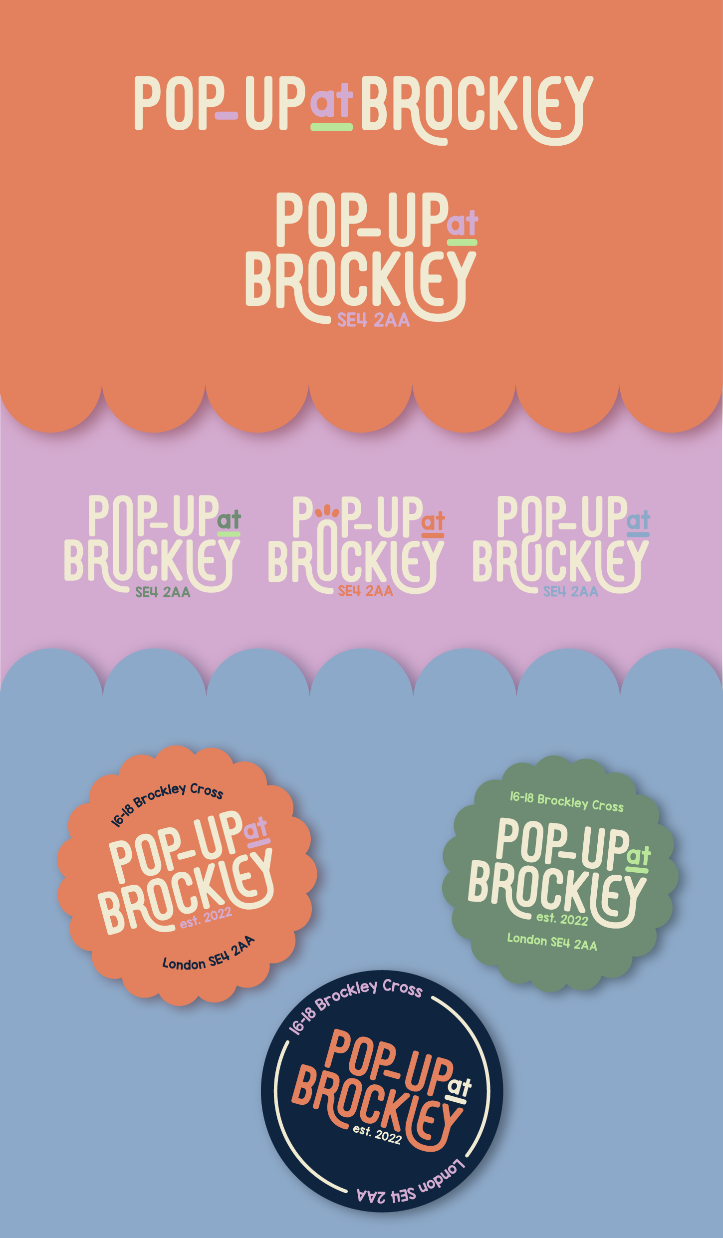

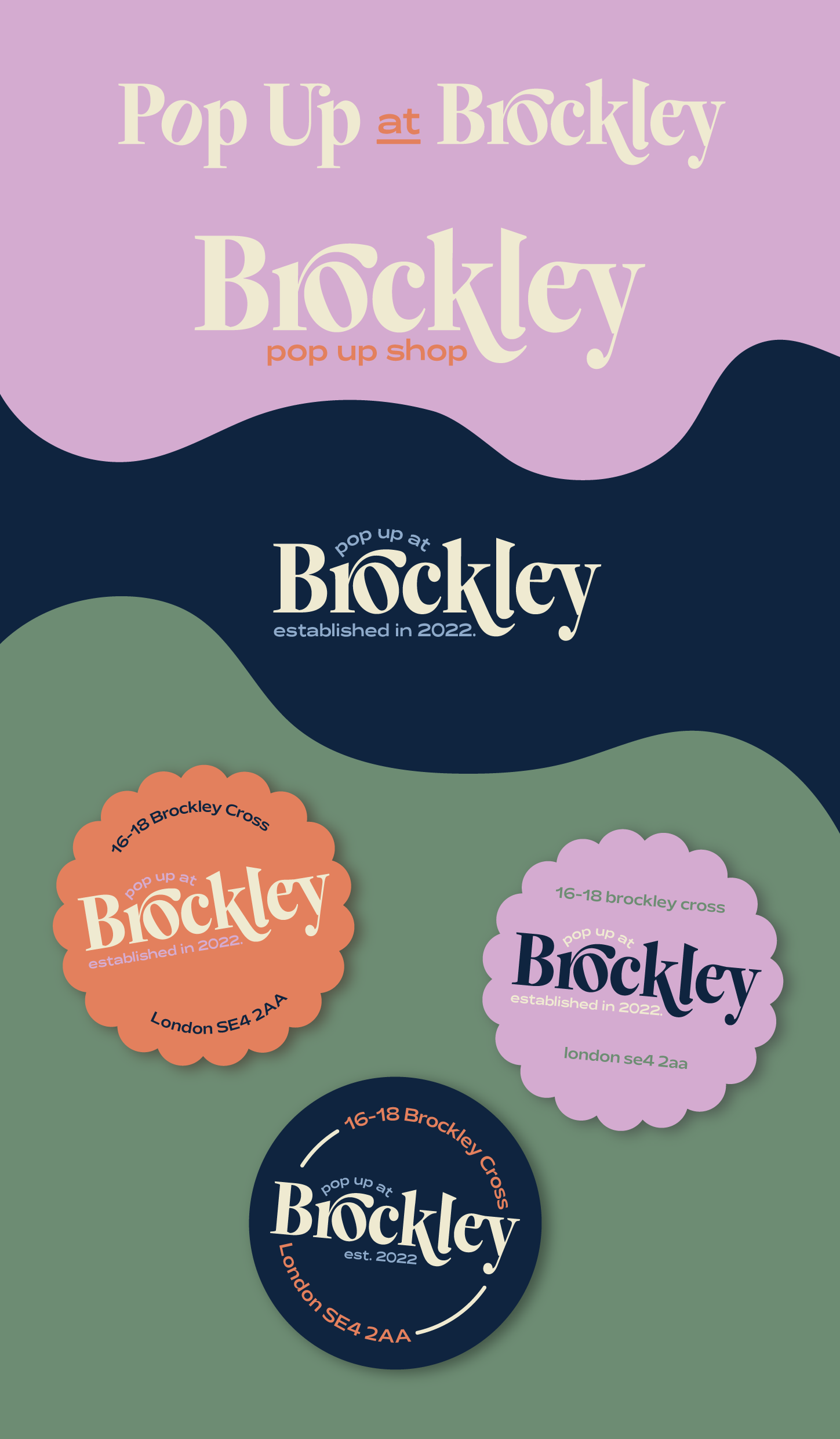
Brockley Pop-up Shop
I was approached by the owner of a london-based pop-up space and asked to help create a stronger presence for the space, through visual identity and branding.
I was given a relatively open brief, with a lot of flexibility. With the key words being classy and minimal, as well as a instructions to maintain a colourful colour palette similar to their existing one, I was aiming to find a happy medium.
This happy medium being an identity that is both inviting and reflective the nature of the space and its function, but also pared back enough that the logos can exist by themselves, without a need for lots of additional branding elements.
I’ve included some of my initial inspiration we discussed, as well as the colour schemes and my concept development for various styles, with various iterations of these logos included to show my process.
Category ········· Logo, Illustration
Completed ······ June 2023
Completed ······ June 2023
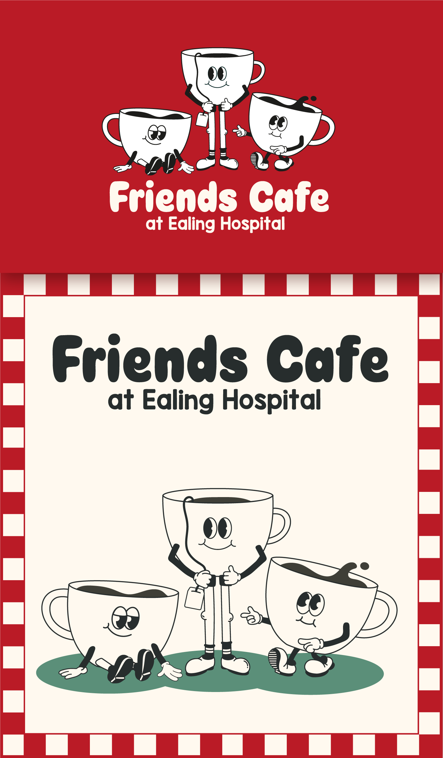
Friends Cafe at Ealing Hospital
Creating a new visual identity for the community-led hospital cafe
I was approached by this organisation to help them to refresh their branding and bring it up to date.
Their colour scheme at that point had been an undefined mix of reds, greens, pinks and shades of white or off-white, with three cartoon cups as their logo, and we decided we would retain some of the essence of the brand, with the inclusion of three cups, whilst creating a more defined colour palette.
We were aiming for a welcoming and youthful feel, so I created two brand concepts, each incorporating the three cups in a different style of illustration, and some inviting typography to go with them.
I have also included some of the materials I developed in line with the branding we decided to go with.Th

Category ········· Branding
Completed ········· March 2021-April 2023
Completed ········· March 2021-April 2023
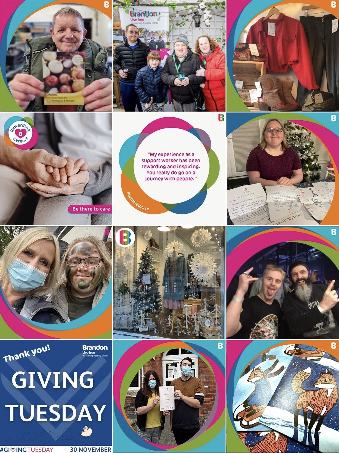
Brandon Trust
A collection of highlights from my time as an intern, and later a Junior Designer at Brandon Trust, a charity that supports adults with learning disabilities and autism
My priority with my work at Brandon Trust was to help create a stronger sense of brand identity.
This identity is centred around accessibility, due to the nature of the organisation, but also simple illustration which aims to help represent those with learning difficulties, who are some of the least-represented in our society.
Category ········· Branding
Completed ········· July 2021
Completed ········· July 2021

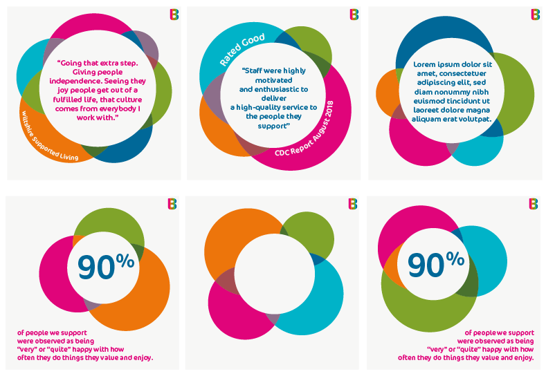
Social Media Suite
Injecting some brand identity into the social media presence of Brandon Trust
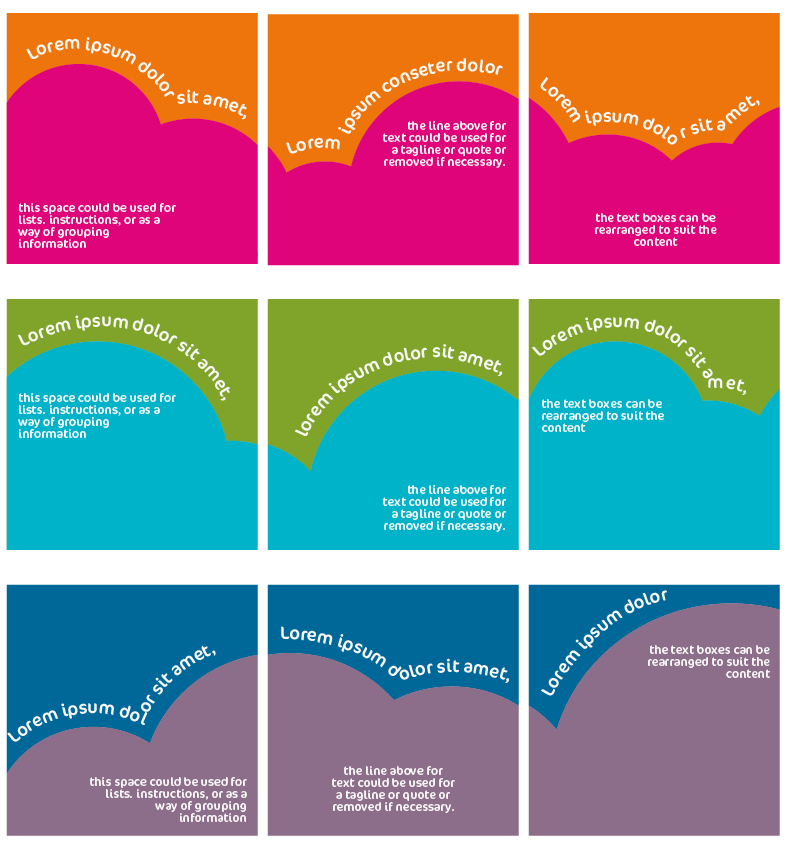
To provide a greater sense of flow and consistency to the charity’s instagram page, I created a series of templates, with multiple interchangeable variations of each.
These designs each serve a different purpose and function.
The templates consist of a photo frame design for every day photo posting, a quote design for short pieces of text and a carousel design, which provides space for sharing more information, with these templates created for use across Instagram, Twitter, Facebook and Linkedin, in the appropriate dimensions.
Check out their social media using @brandontrust
Category ········· Logo, Illustration
Completed ······ August 2021
Completed ······ August 2021
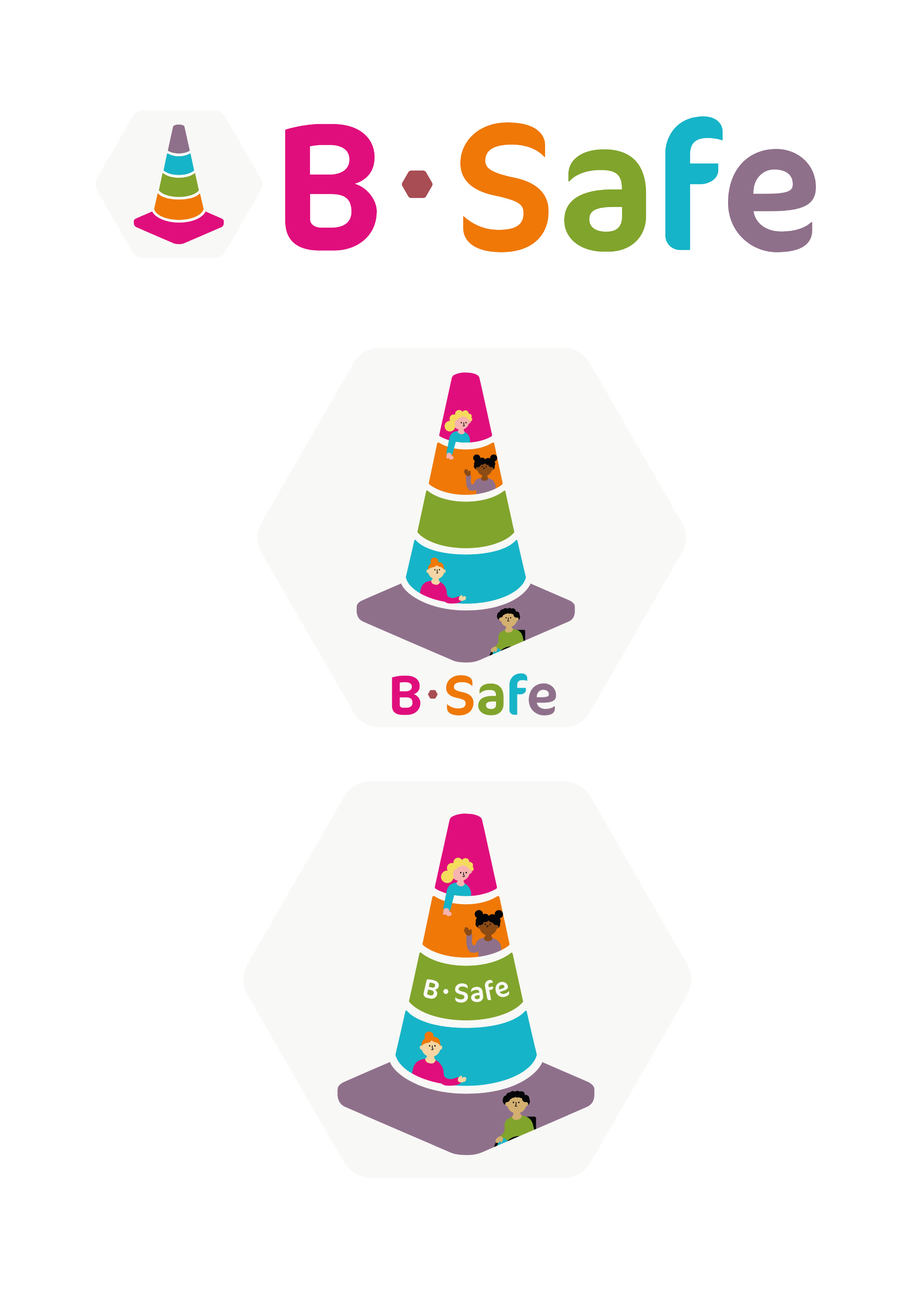
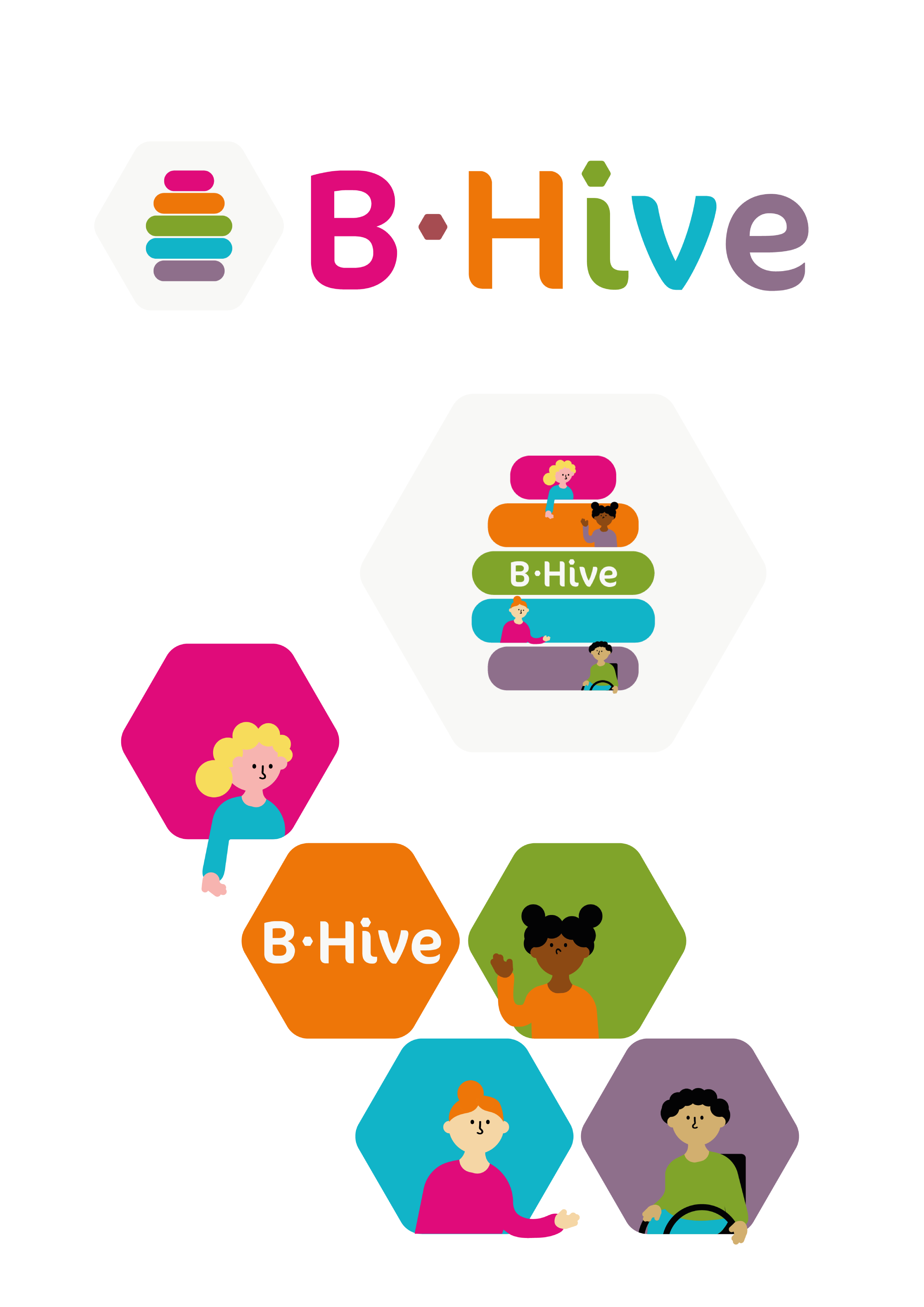
HR System Logos
Creating visual identities for the new HR systems, B-Hive and B-Safe
This project started with B-Hive and later extended into B-Safe.
The intention was to create imagery that provided a subtle nod to the B theme, whilst incorporating the theme of community, inkeeping with existing brand identity I have produced for the charity
I created an abstract bee hive shape for the main logo, and replaced the hyphen and ‘i’ dot with a hexagon shape, as a nod to a honeycomb
The subsequent B-Safe designs were created to closely mirror the style of the B-Hive designs.